The challenge
The challenge was to develop a habit-forming product that fosters kindness, and I chose to centre it around the concept of charity. I aimed to design a solution that seamlessly integrates charitable actions into users’ daily routines, encouraging a habit of giving and spreading kindness.
<span data-metadata=""><span data-buffer="">Project Description
This project aims to develop a habit-forming product that motivates and reminds users to incorporate acts of charity and kindness into their daily lives. The project leverages the Hook Model approach to test and validate design ideas specifically tailored to the needs of the users. By creating a habit-forming experience, the project aims to instil a lasting habit of practicing charity and promoting kindness as an integral part of users’ daily routines.
Challenges in Cultivating a Giving Habit
Charity can be difficult to make a habit because it requires a shift in mindset and priorities, lacks immediate personal benefit, and may be hindered by financial constraints. Limited awareness and understanding of charitable opportunities also pose challenges. Overcoming these barriers and finding accessible ways to contribute are key to incorporating charity as a habit.
Conceiving the Idea
The idea for “Walk of Cause” stemmed from a desire to bring together fitness, community, and charitable giving in a meaningful way. I realized that walking and running are popular daily activities, so why not turn them into opportunities to raise funds for worthy causes? My inspiration came from the belief in the power of small actions and the collective impact they can have. I wanted to make it easy and convenient for people to contribute to charity, and thus I carefully developed an app that lets users choose a cause, track their movement, and convert their steps into monetary donations.
The project’s inception involved careful research into existing charitable initiatives and innovative models for promoting philanthropy. Through research, use of behavioral psychology and using the principles of the Hook Model, I created a habit-forming product that not only promotes physical activity but also makes a positive difference through charitable giving. Our vision is to empower individuals to create change simply by going for their daily walks or runs.
Design methodologies used
Design methodology used to guide the overall design activities are the MVP model of Build measure and learn, the Hooked model by
Nir Eyal, and the Cupcake model of MVP. These methodologies encompass the principles, methods, and techniques employed to solve design problems and create user-centred solutions. It provided me with a structured framework for conducting research, ideation, prototyping, and evaluation.

Applying the five elements of UX design
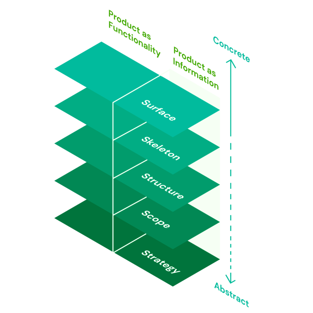
To transform my idea into a functioning product, I employed the five key elements of UX Design as a framework. These elements were Strategy, Scope, Structure, Skeleton, and Surface, with each layer building upon the one beneath it. I began by laying the foundation with Strategy, ensuring a thorough understanding of both the user’s and business’s needs and goals.
This understanding was then translated into functional and content requirements during the Scope phase. Moving forward, the Structure phase established the interaction framework for the system, while the Skeleton phase outlined the presentation of information to ensure clarity and ease of use. Finally, Surface brought all the elements together, culminating in the final visual presentation of the product.
Strategy
Storyboarding using the Hooked Model
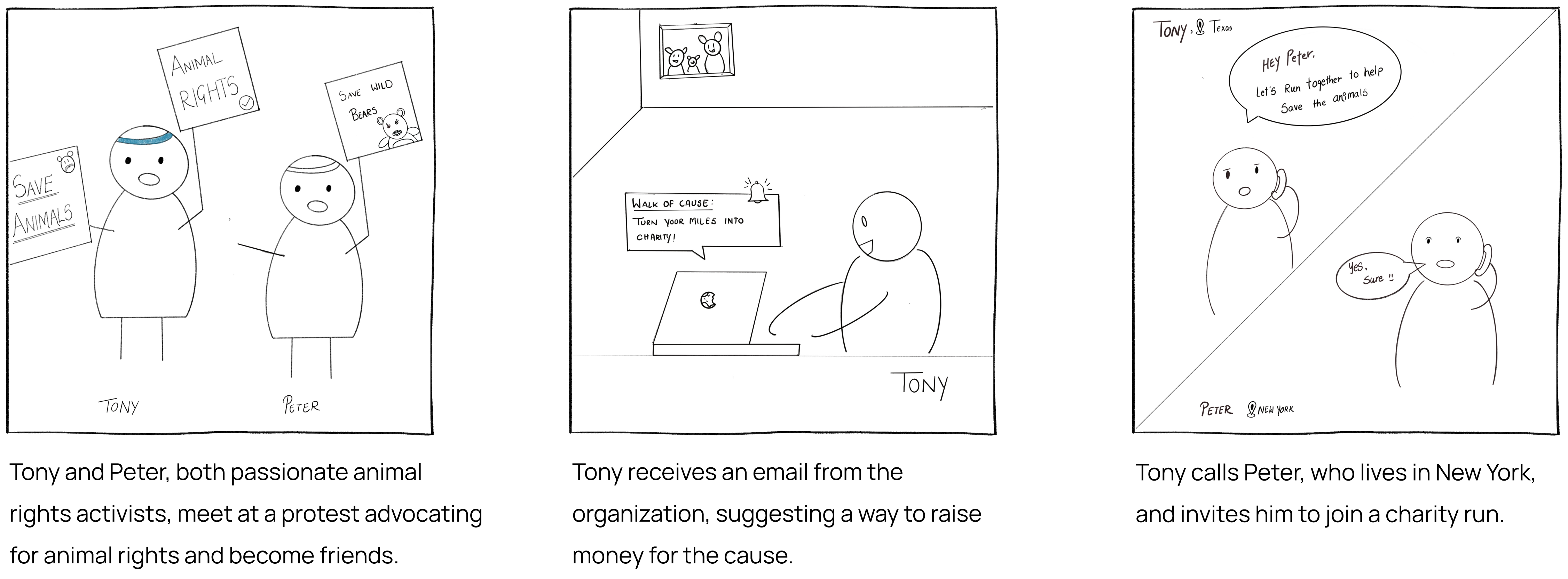
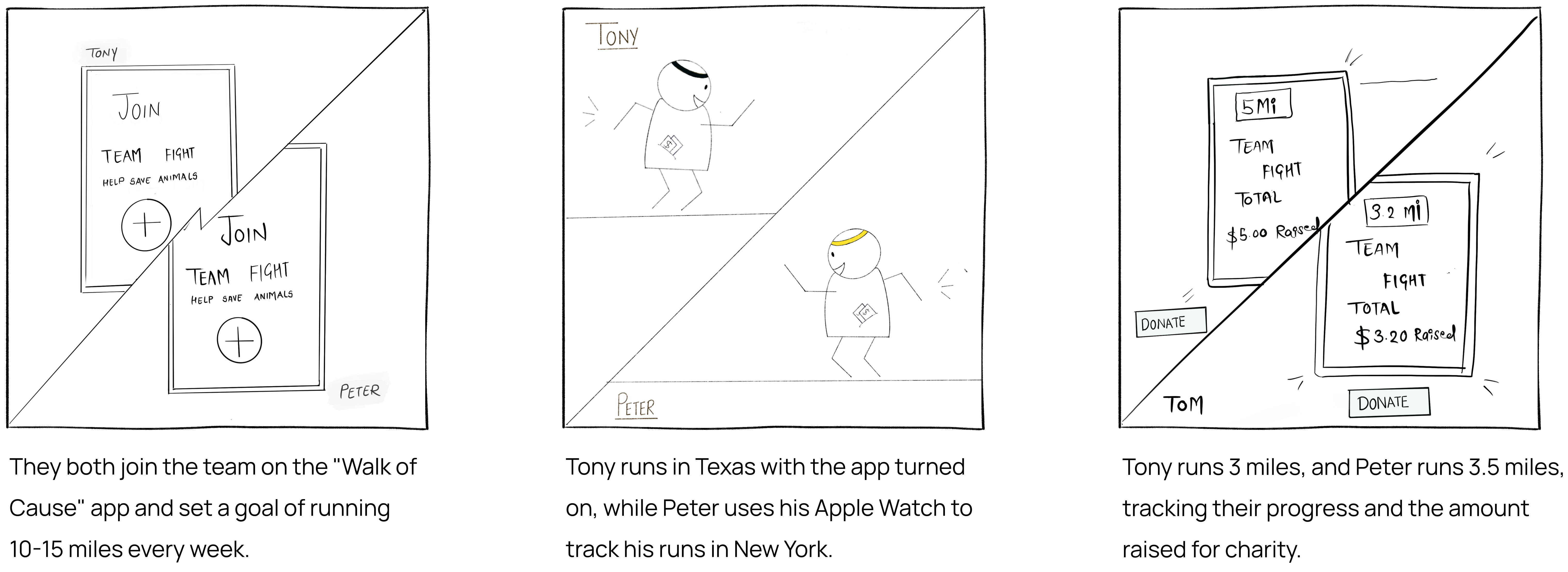
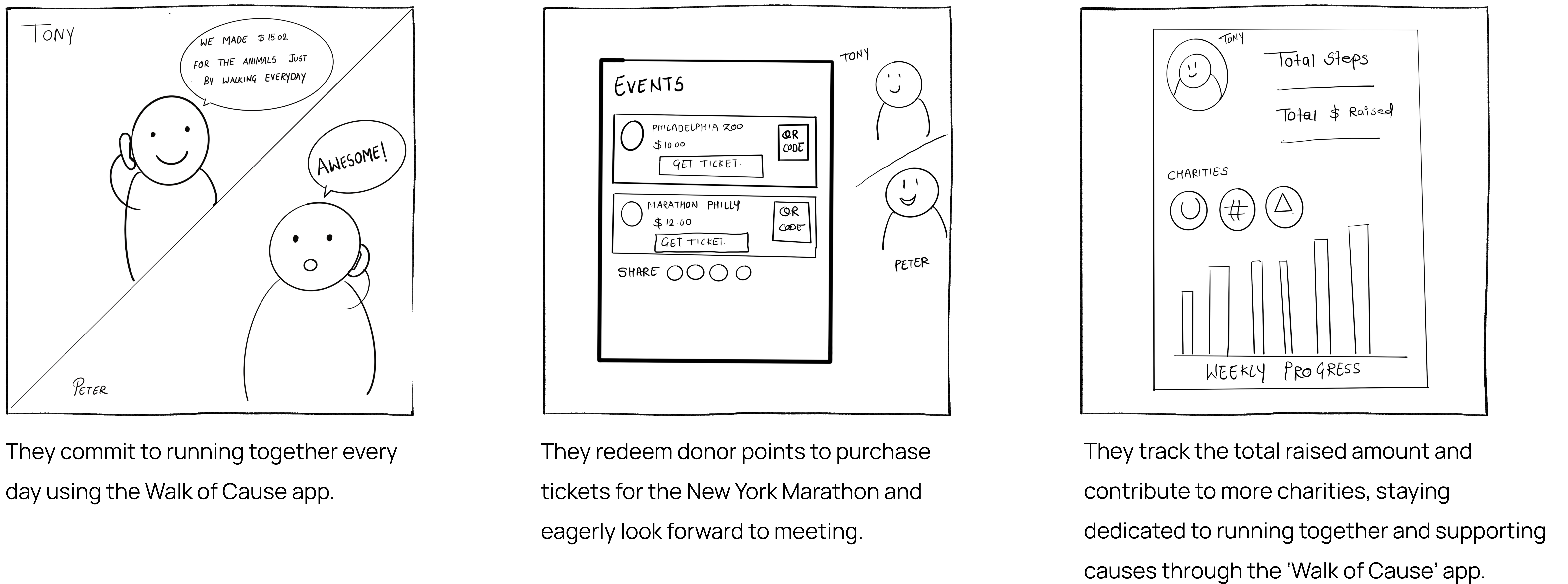
Storyboarding is a user-centred design approach that captures, communicates, and explores user experiences throughout the design process. The storyboard presented below depicts the journey of Tony and Peter as they engage with the “Walk of Cause” app, which allows users to earn money for charity through walking, running, or biking. The storyboard highlights their experiences before, during, and after using the application, showcasing the positive impact and convenience it offers.
Scoping
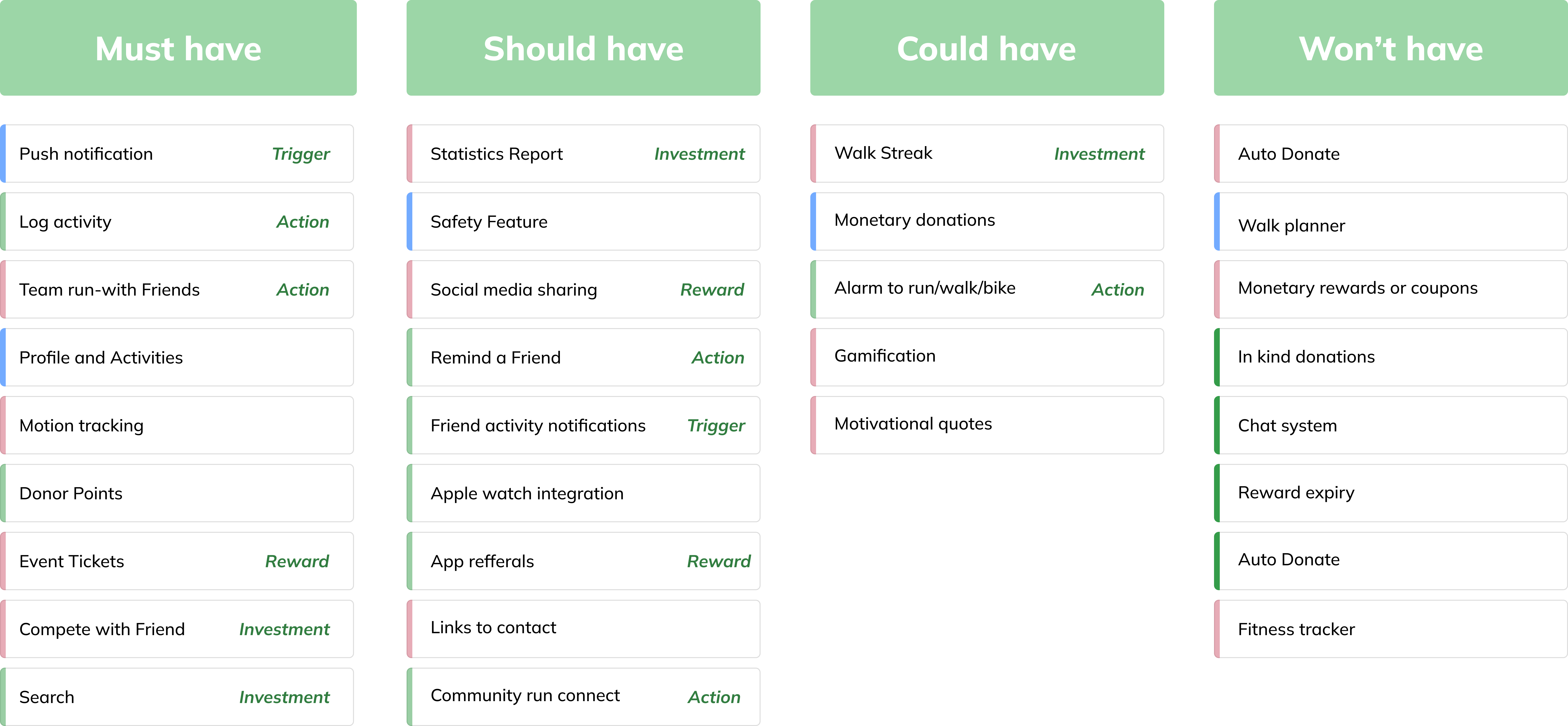
MOSCOW method of building MVP
The MOSCOW method proved invaluable in optimizing the site flow by prioritizing the ‘must have’ and ‘should have’ features that are crucial to the user experience. These non-negotiable needs were identified and prioritized to ensure the application delivers the necessary functionality and meets the core requirements of its users.
Cupcake model- The Cupcake model aimed to begin with a small yet highly desirable release, followed by additional iterations that balanced user expectations with delightful additions. This approach created a unique and exceptional experience for the’Walk of Cause’ app.
Structure
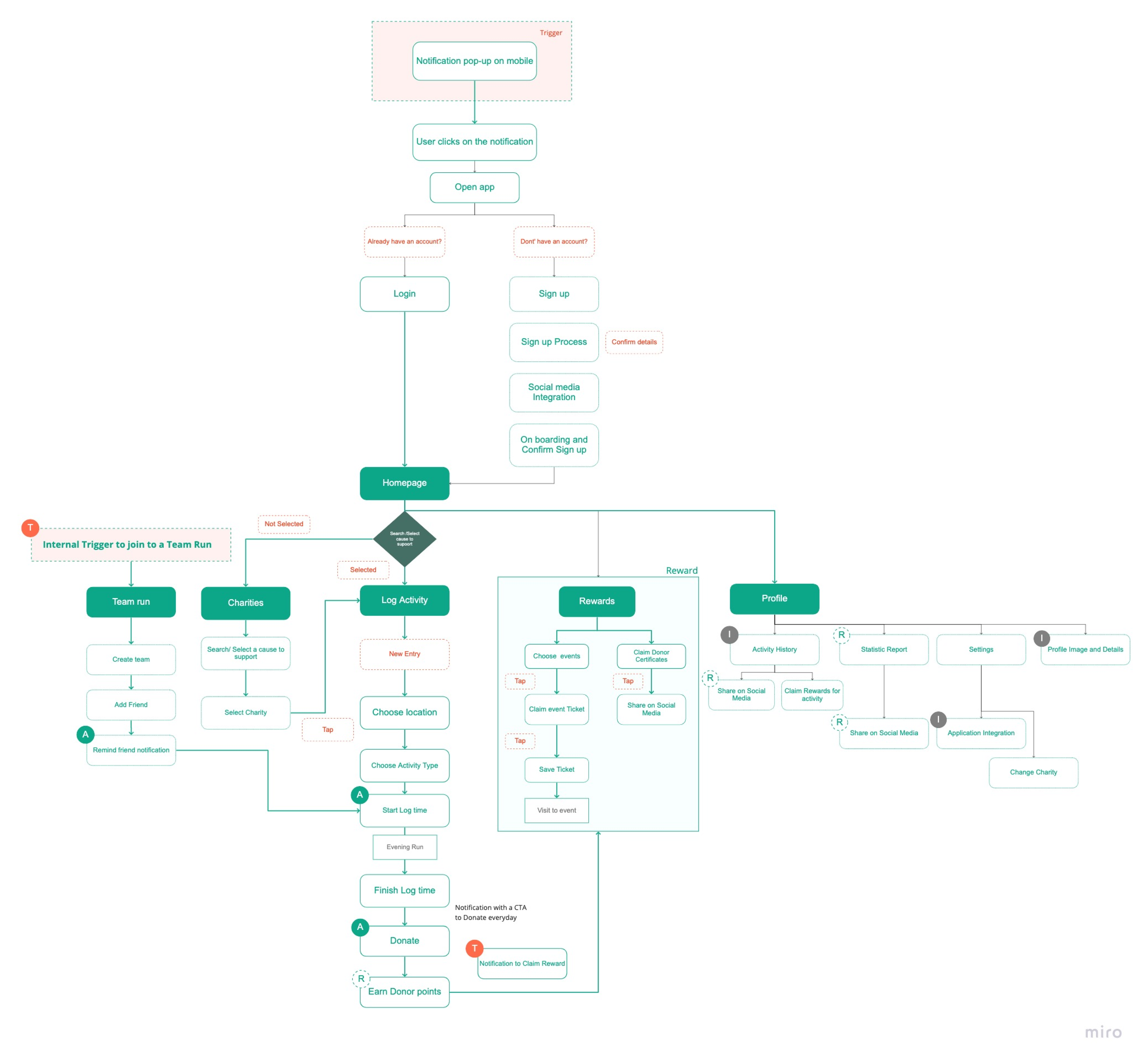
Siteflow
To establish a user-centric structure for ‘Walk of Cause’, I developed a user flow that visually outlines the series of steps users take to navigate the app and accomplish specific tasks. This mapping process ensures that the app’s structure aligns seamlessly with the users’ needs, allowing for a streamlined and intuitive user experience. By visually representing the user journey, I identified potential pain points, optimize task completion, and create a cohesive and engaging app interface.
Skeleton
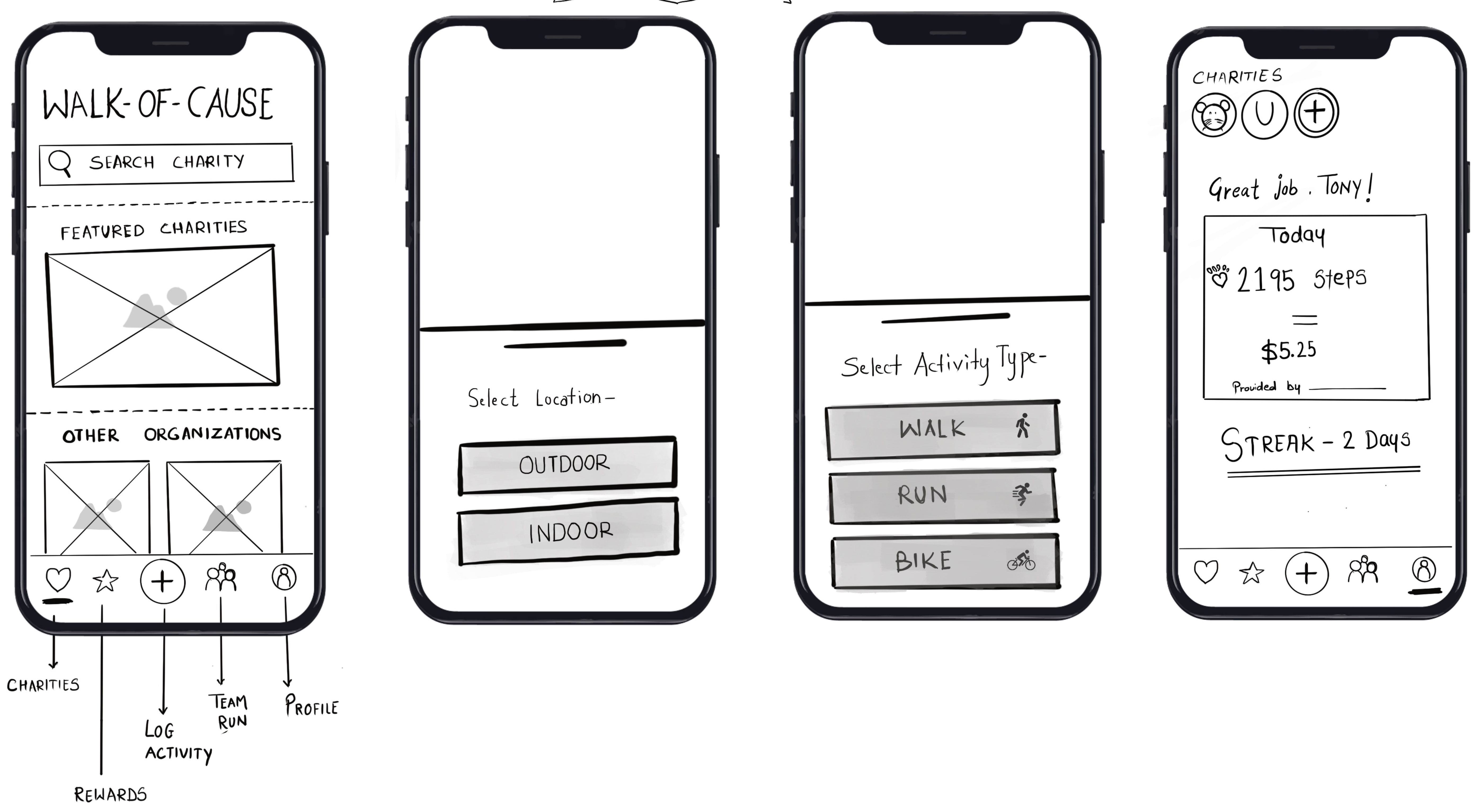
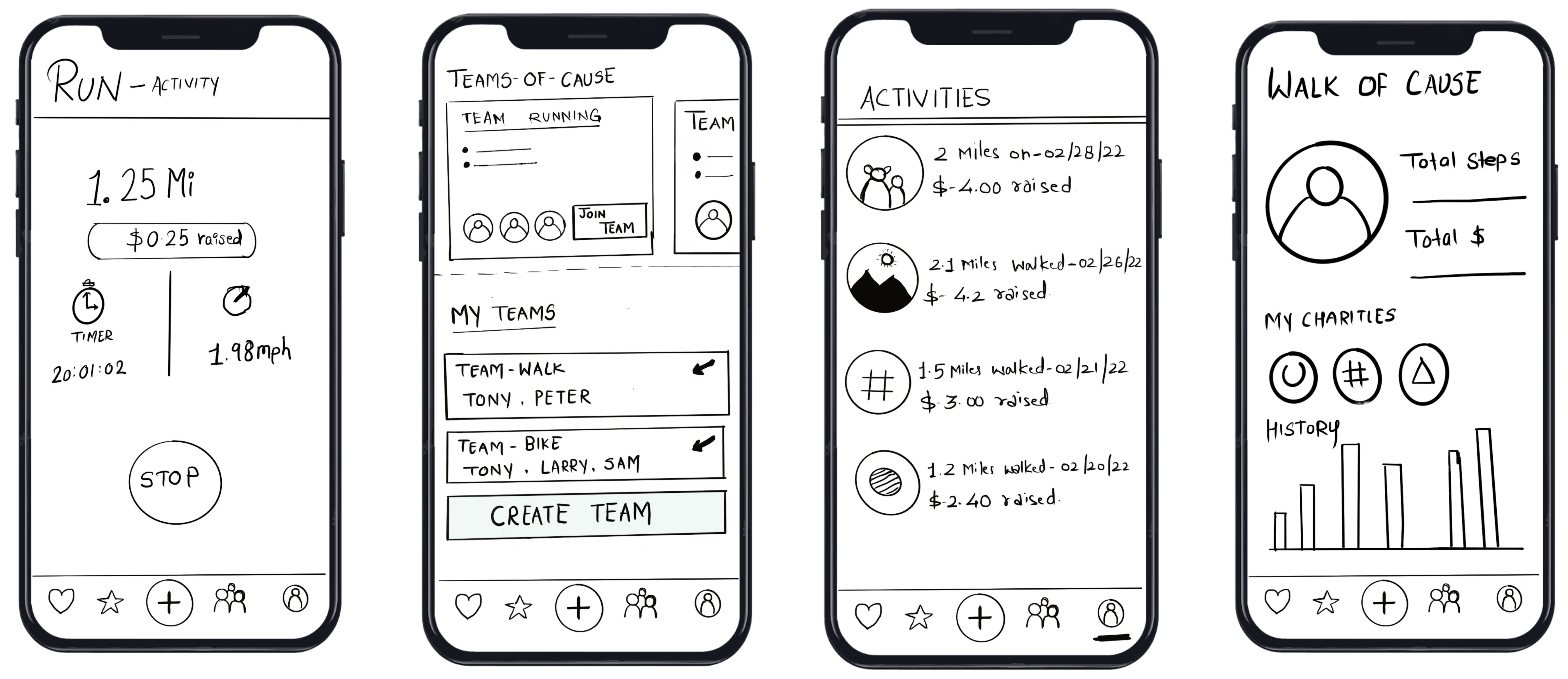
Wireframes
Surface
Moodboards
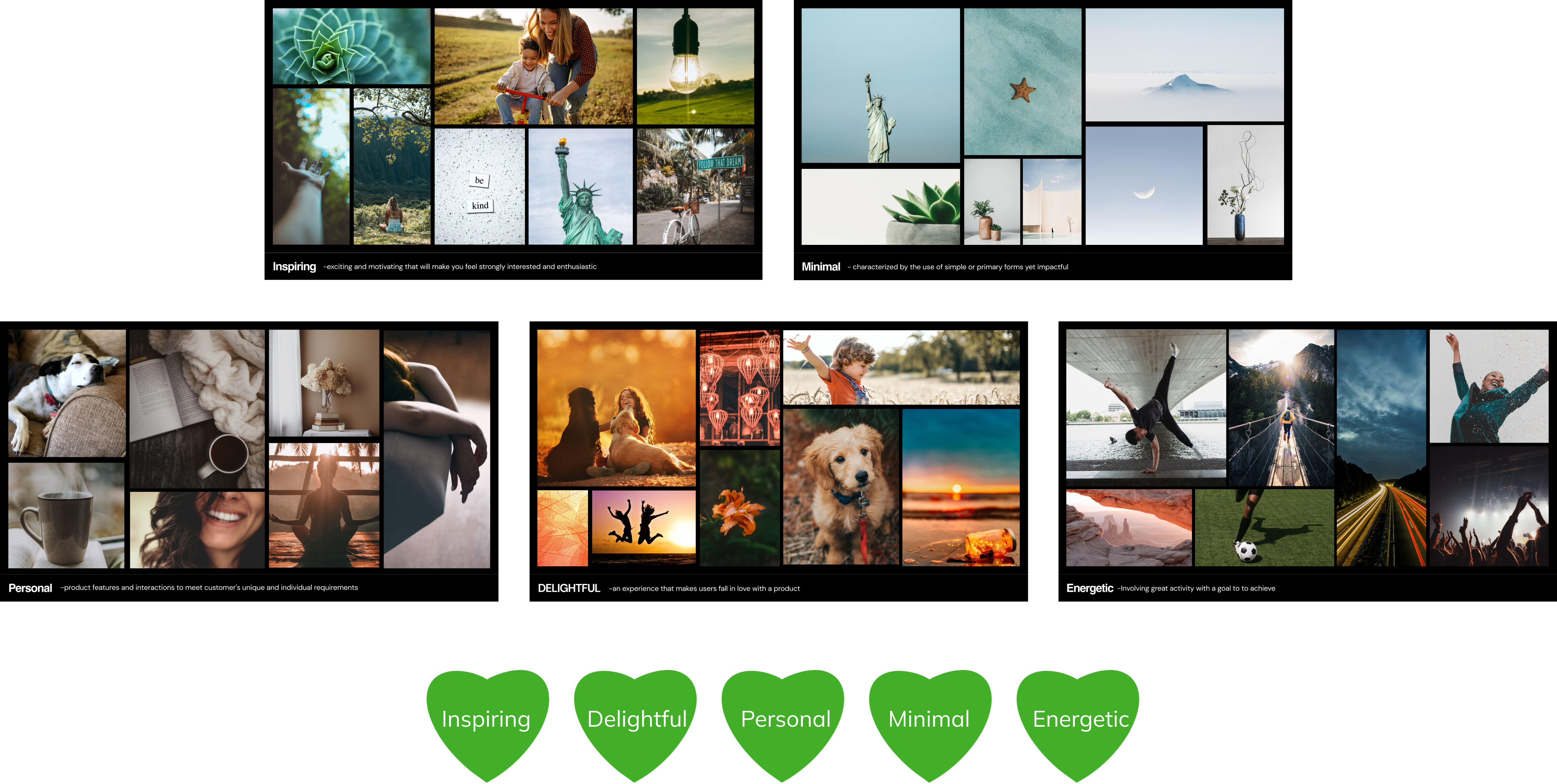
‘Charity’ embodies the essence of kindness, encompassing a range of emotions such as personal, inspiring, delightful, energetic, and minimal. To capture the visual tone of each emotion, I curated five distinct mood boards. These mood boards showcase the diverse feelings associated with kindness and charity, allowing me to convey their essence through compelling visuals and design choices. By exploring these different moods, I can effectively convey the essence of charity through compelling visuals and design choices.
Surface
Design Scheme
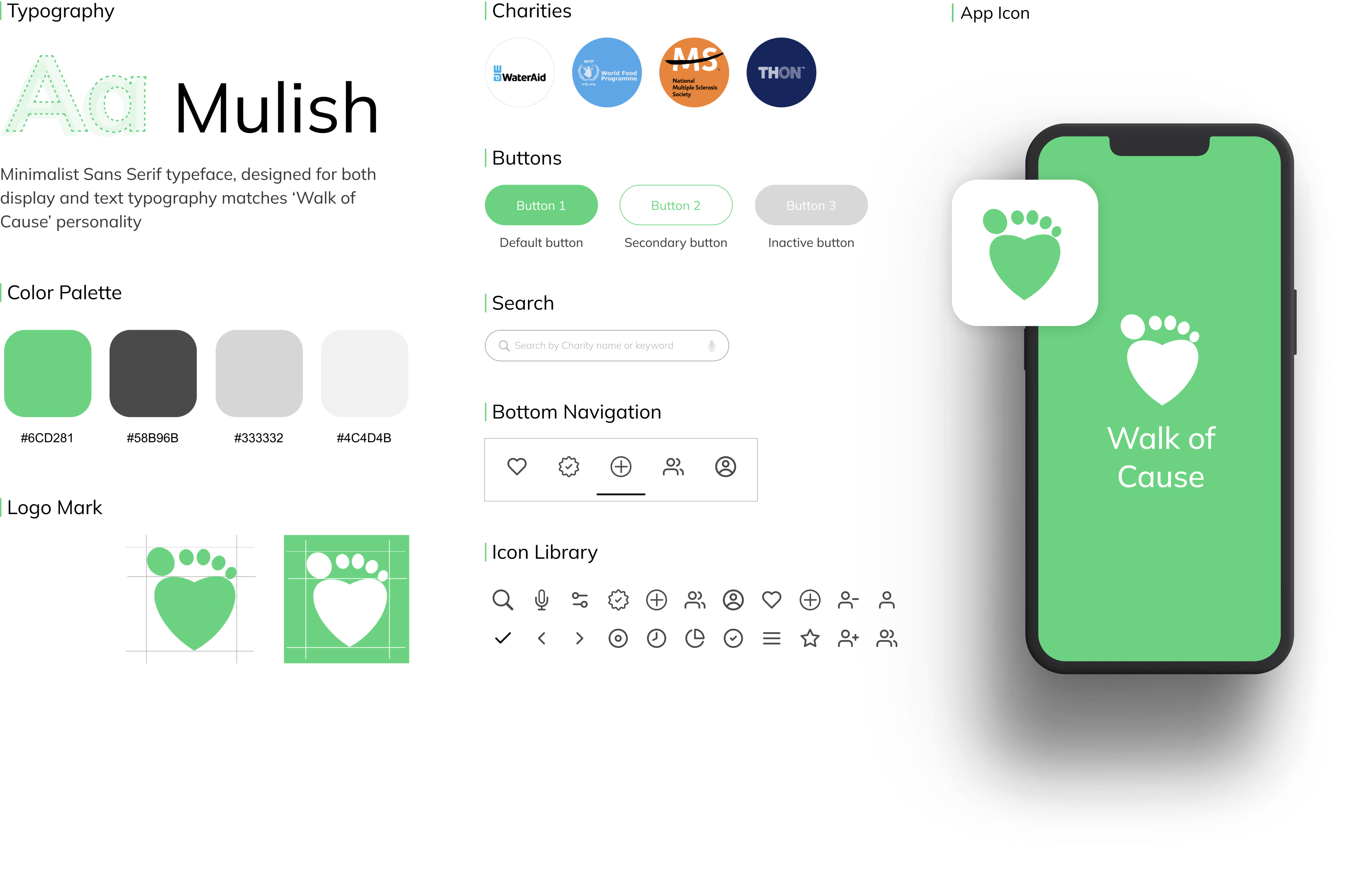
After targeting an emotional response, I put together supporting imagery, font styles, icons, paragraph styles and color palette. I created a logo mark that depicts the ‘walk of cause’ intention and purpose of the app.
Digital Design Experience
Digital Prototype
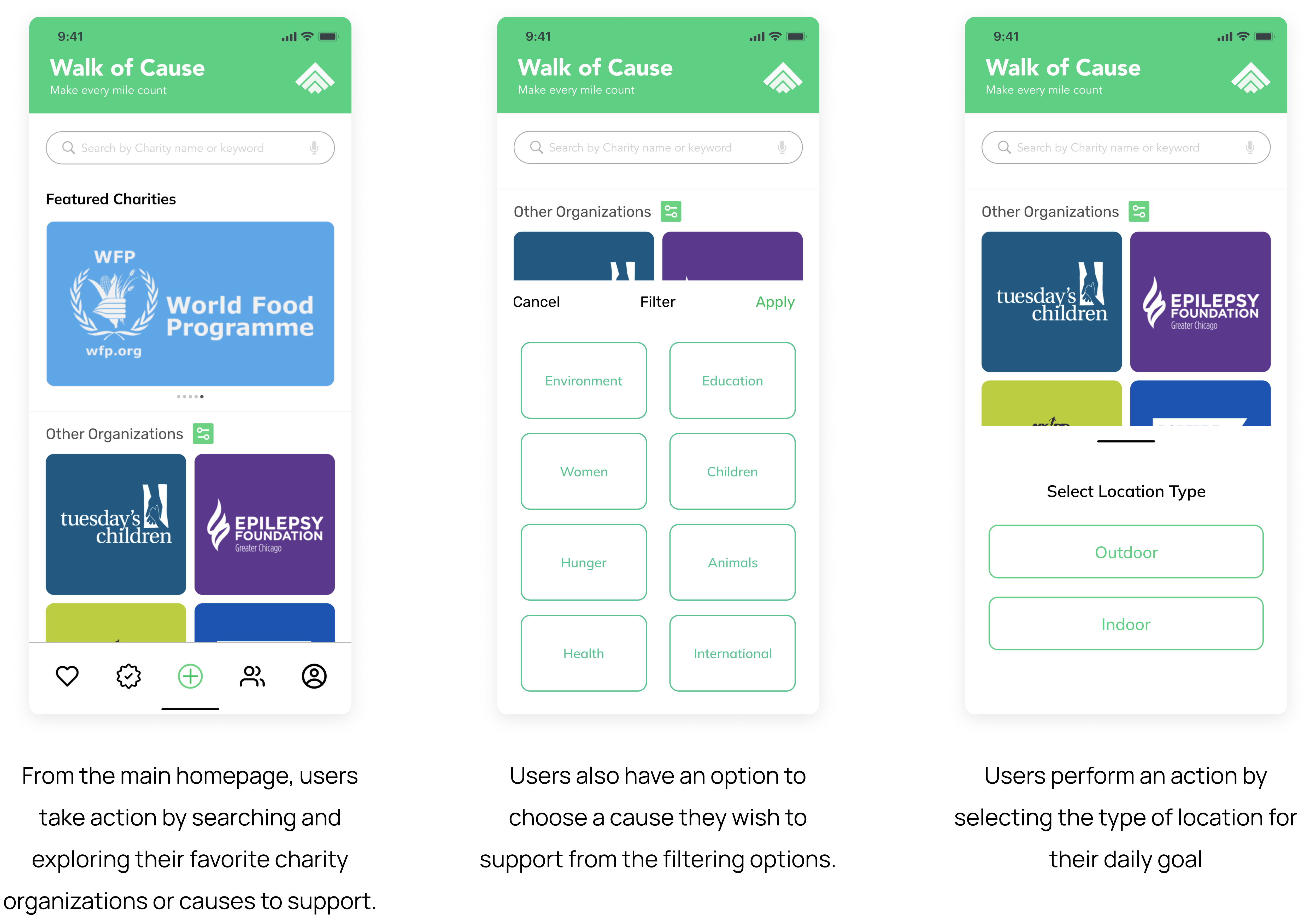
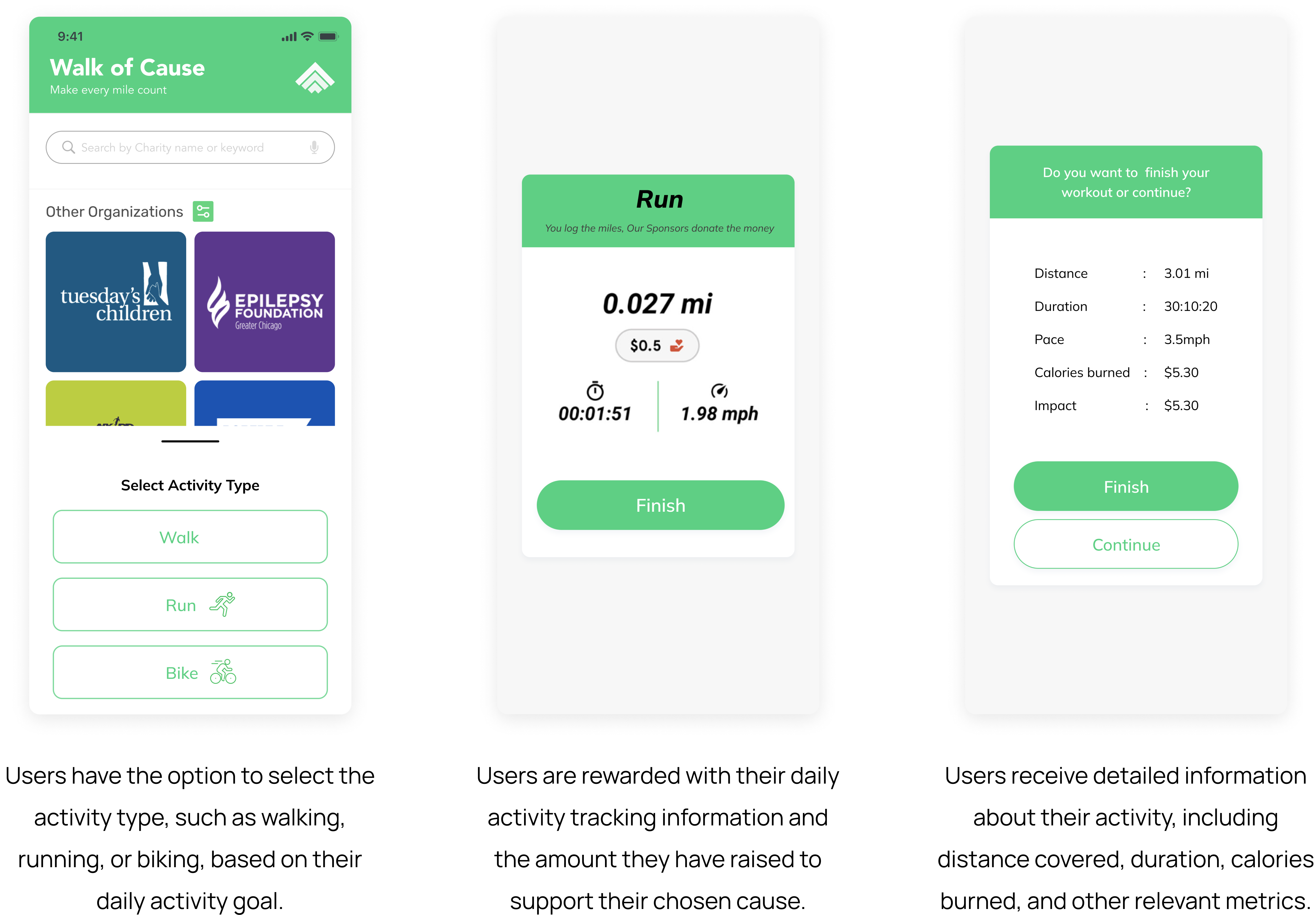
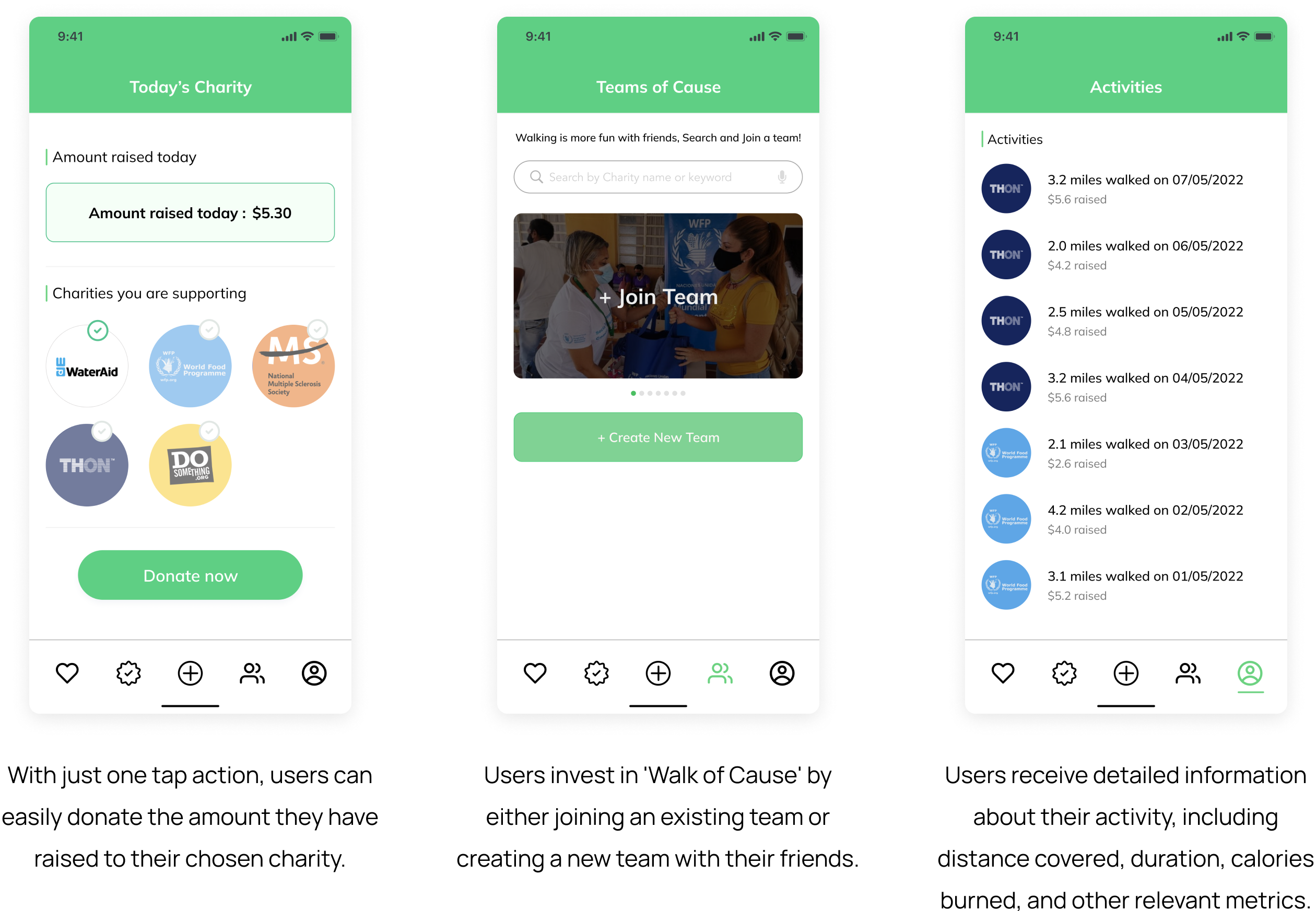
The final stage in bringing the visual representation of Walk of Cause to life was to integrate all the elements and create a functional prototype. I used Figma to develop screen mockups as well as an interactive model that seamlessly connects all the screens and functionalities.
Part 02 - Non GUI solution
A Non-GUI Solution for forming charity habits
Embracing the potential of smart tattoos
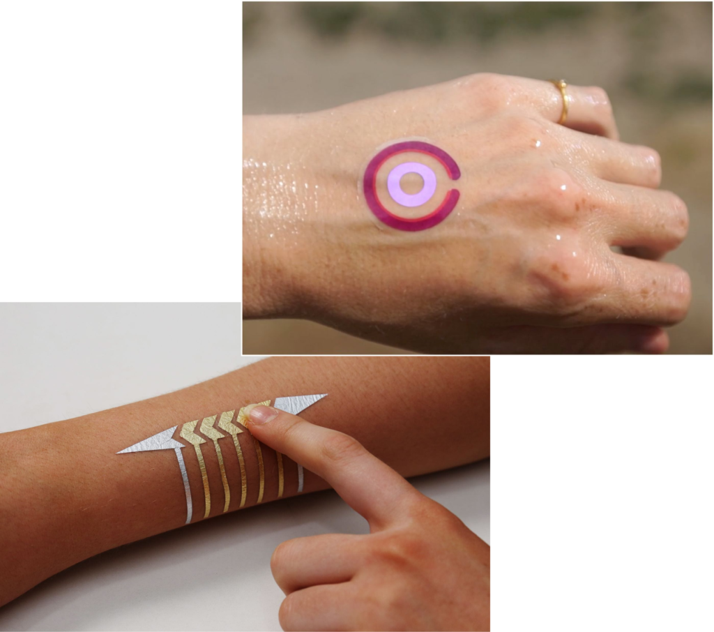
Athletes and runners are drawn to smart tattoos over other wearable devices as they offer seamless and non-intrusive monitoring of performance, vital signs, and training data.
Unlike bulky wearables, smart tattoos are lightweight, applied directly to the skin, and eliminate the need for additional accessories. They represent a futuristic approach to wearable technology, merging with the body to provide personalized and discreet monitoring capabilities. As a part of my academic project, I chose to leverage more on this technology and developed a Non-GUI Solution for forming charity habits.
Filip Smart Skin
You most personal device
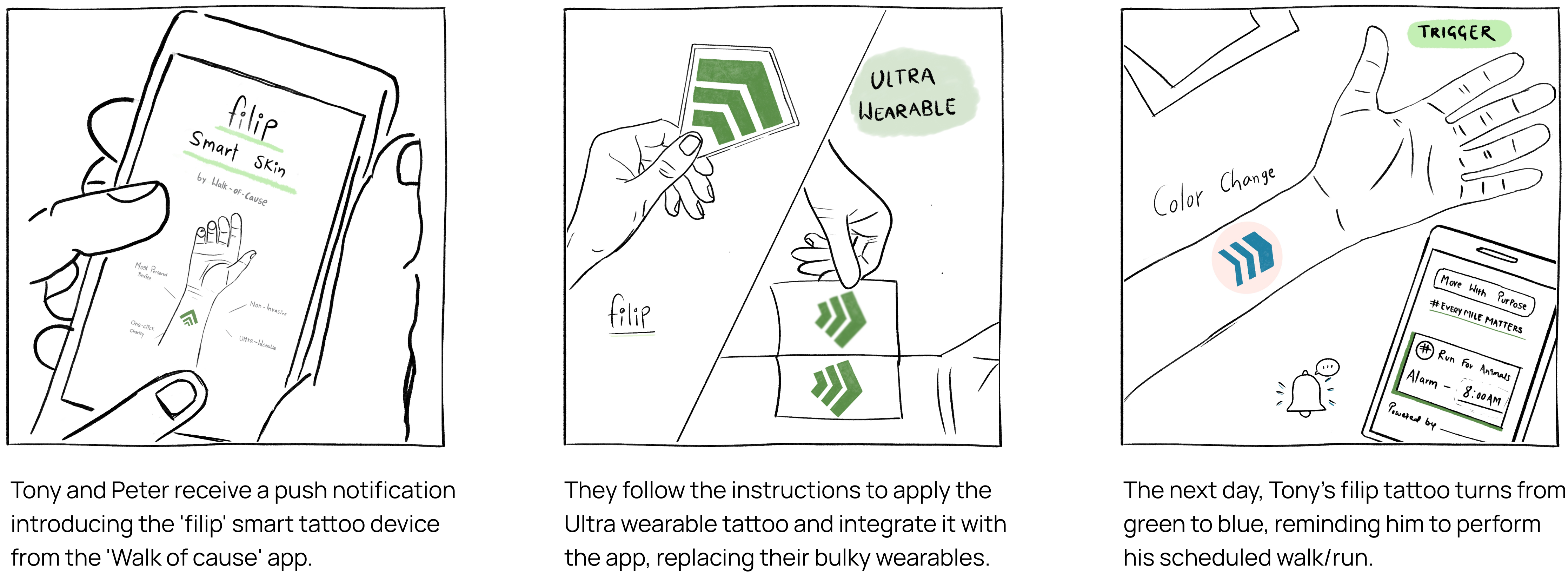
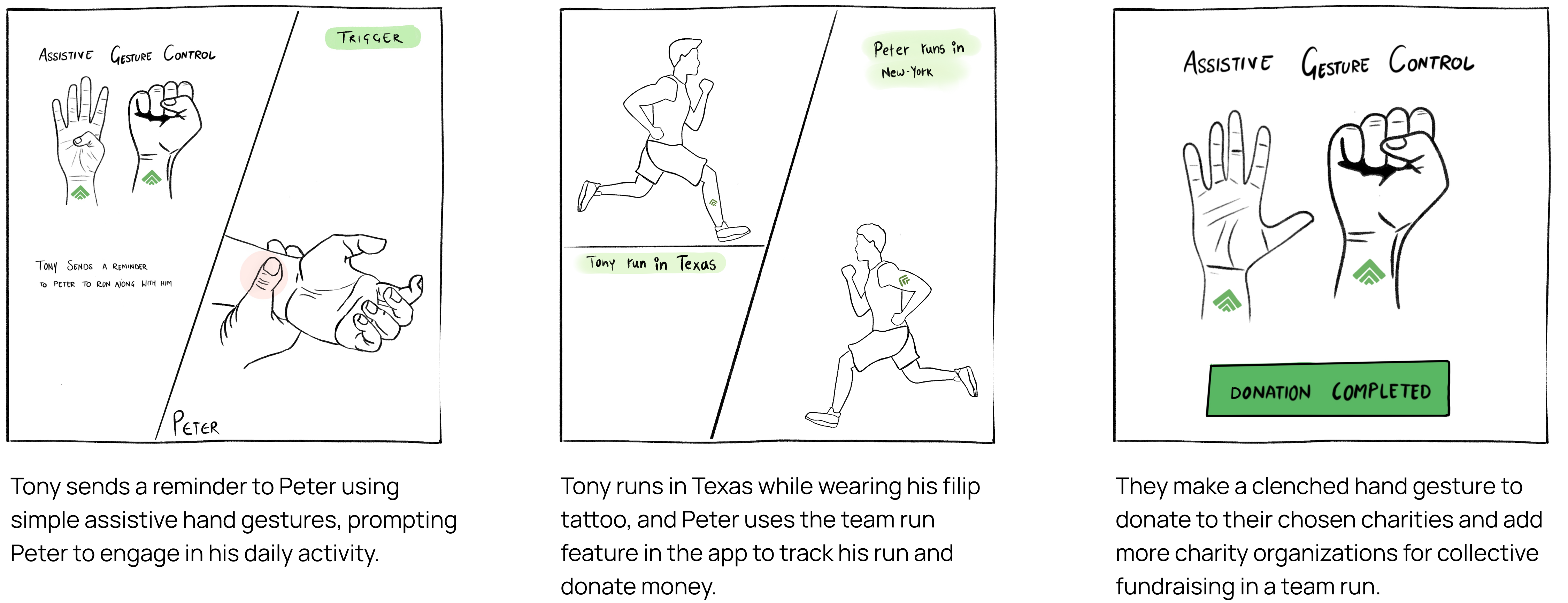
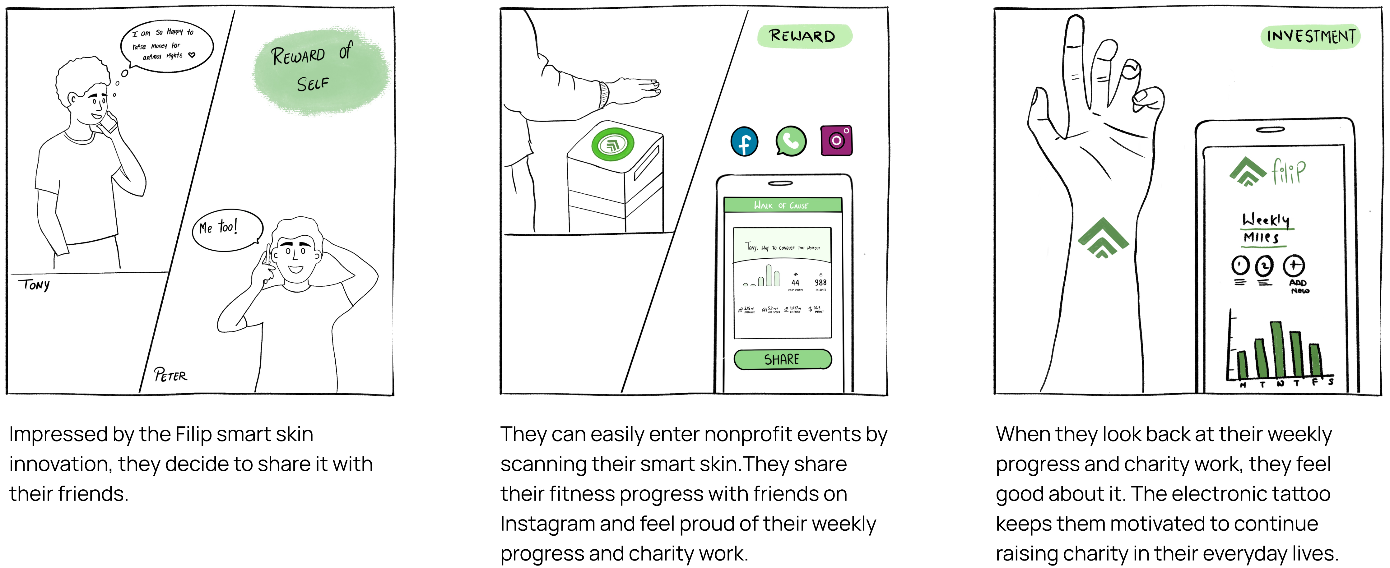
Filip’s non-invasive electronic tattoo monitors their health, vitals, and all the other good things necessary for athletes, hikers, and fellow runners to monitor and track their performance. The color-changing activity indicator embedded in Filip’s non-invasive electronic tattoo serves as a visual reminder for individuals to engage in daily physical activities such as walking, running, or biking. This indicator changes color based on the user’s activity level, providing real-time feedback and motivation to stay active. By consistently achieving their activity goals, users can accumulate earnings displayed in the app, which can then be donated to a cause of their choosing through the ‘Walk of Cause’ application.
Characteristics
- Future of wearables
- Most personal device
- Uniquely motivating
- Technology + Design
- Rewarding
- Effortless Charity
Strategy- How will it work?
Storyboarding using the Hooked Model
Validating the concept of ‘Filip’ smart tattoo
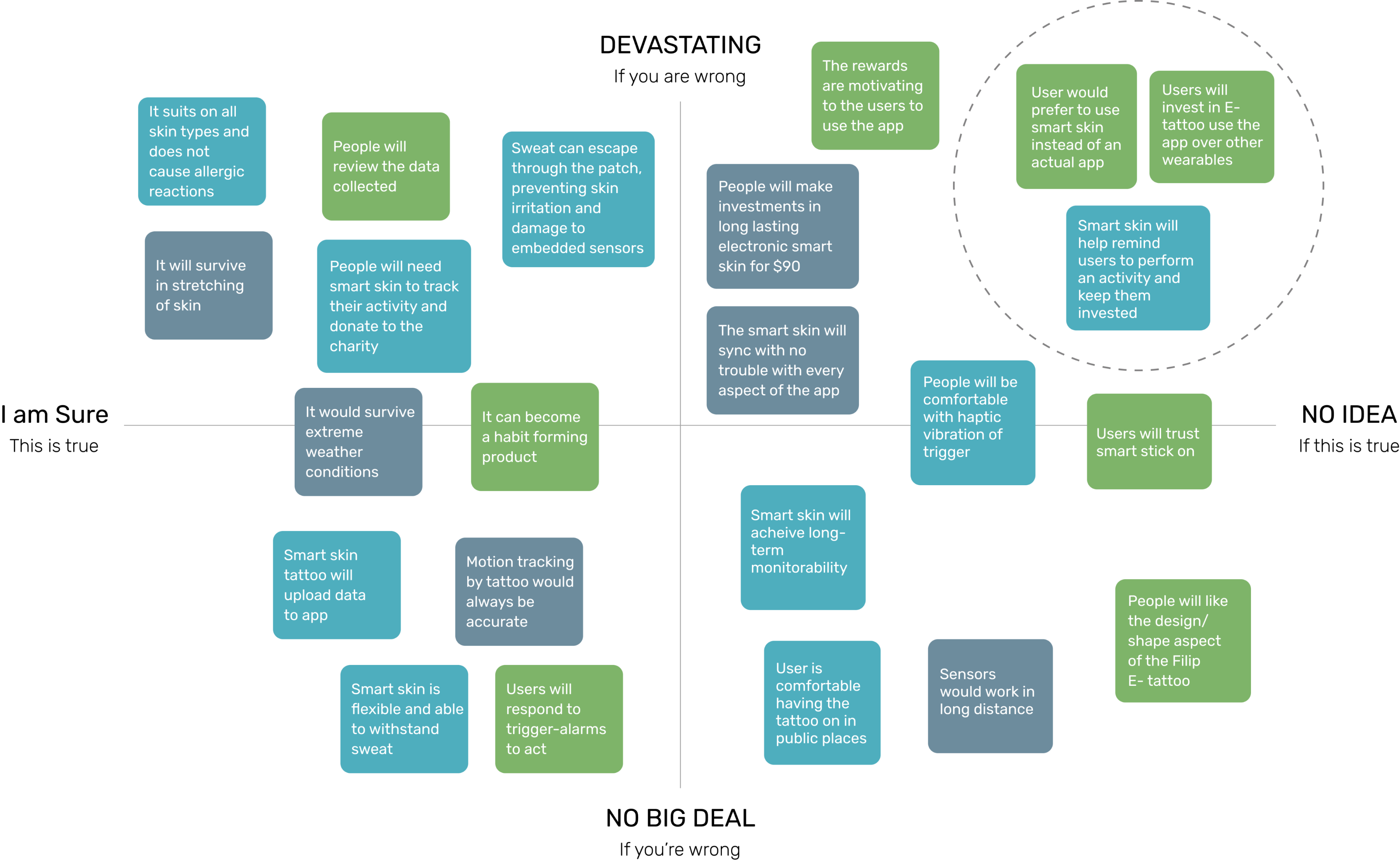
Filip smart skin evolved from my idea to use the popular ‘walk of cause’ mobile application described above and build a new Non-GUI concept/product centred on the same. During the product design process, I made several assumptions and assessed their level of risk and certainty using a Risky Assumption matrix. From this matrix, I identified the top three riskiest assumptions that, if proven incorrect, could have a significant impact on the success of Filip.
These three assumptions were-
1. People will want to understand more about the Filip smart skin.
2. Users want a new way of tracking their fitness progress every day and will raise charity along.
3. People would actually donate after tracking their everyday actions.
Performing pretotyping experiments to verify assumptions
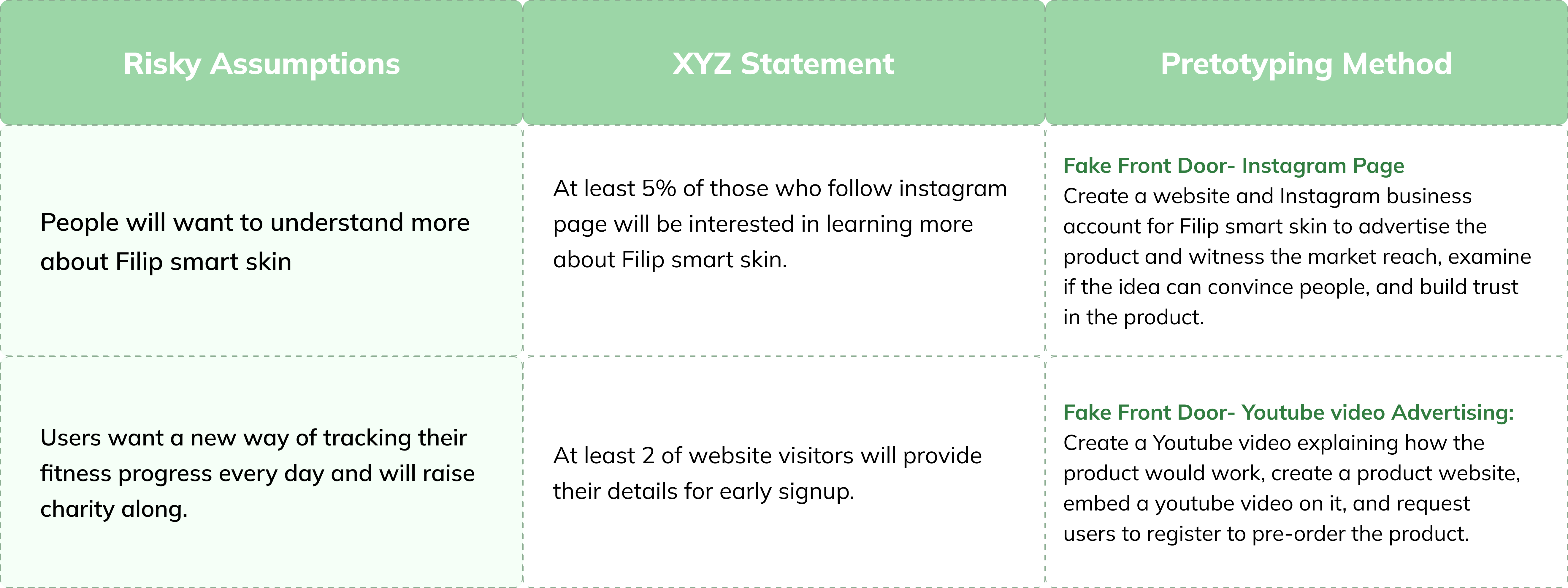
Pretotyping experiments are small-scale tests conducted to validate assumptions and gather feedback on a product or idea before investing significant time and resources into its development. These experiments aim to quickly and cost-effectively assess the feasibility, desirability, and potential success of a concept. To validate the risky assumptions of ‘Walk of cause’ app, I opted for two pretotyping techniques and set a success criteria using XYZ statements. These statements represent specific metrics regarding the quantity, target audience, and desired outcomes of the pretotype experiments.
Experiment 01 - Fake Front Door
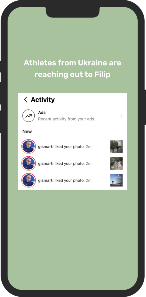
The fake front door pretotyping method, pioneered by Alberto Savoia, enables rapid testing and validation of ideas by simulating user experiences. It allows for validating assumptions and testing product viability without building the full solution. I created a product website and Instagram business account for Filip smart skin to advertise the product and witness the market reach, examine if the idea can convince people, and build trust in the product. It facilitated rapid experimentation, saved resources, and ensured a better alignment with user needs and preferences.
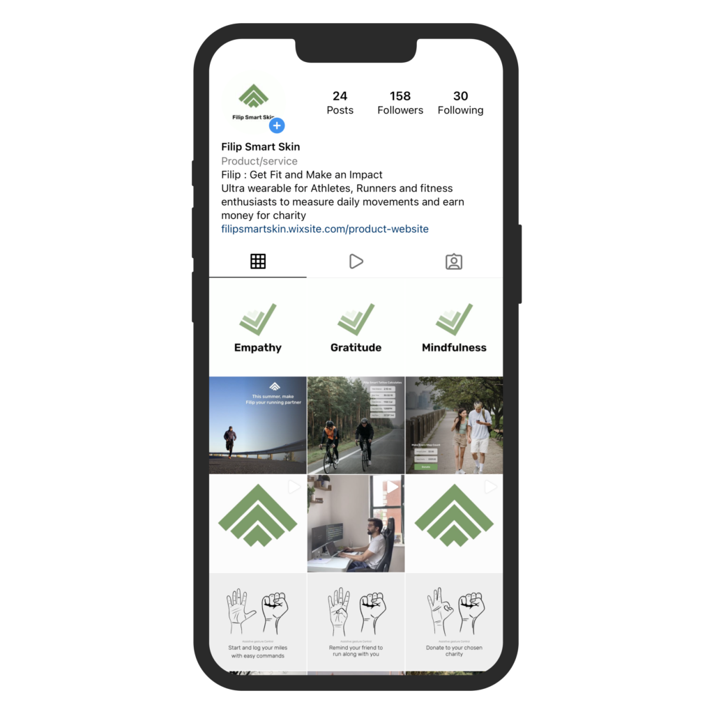
Instagram page
Risky Assumption
People will want to understand more about Filip smart skin.
Success criteria
At least 5% of those who follow instagram page will be interested in learning more about Filip smart skin.
Result
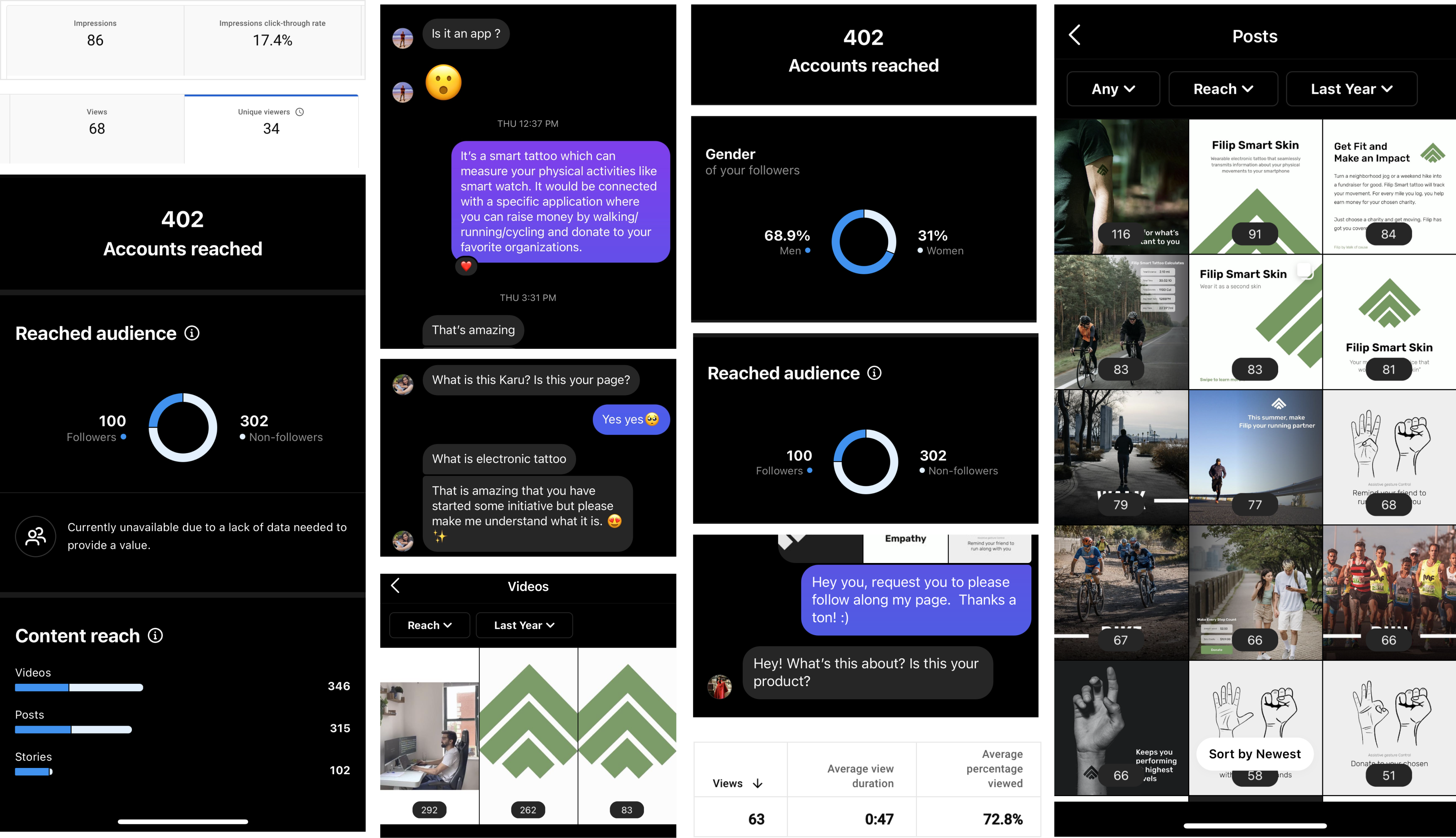
15 of the 158 people who followed the Instagram page inquired about Filip smart skin.
Experiment 02 - Youtube Video + Product Website
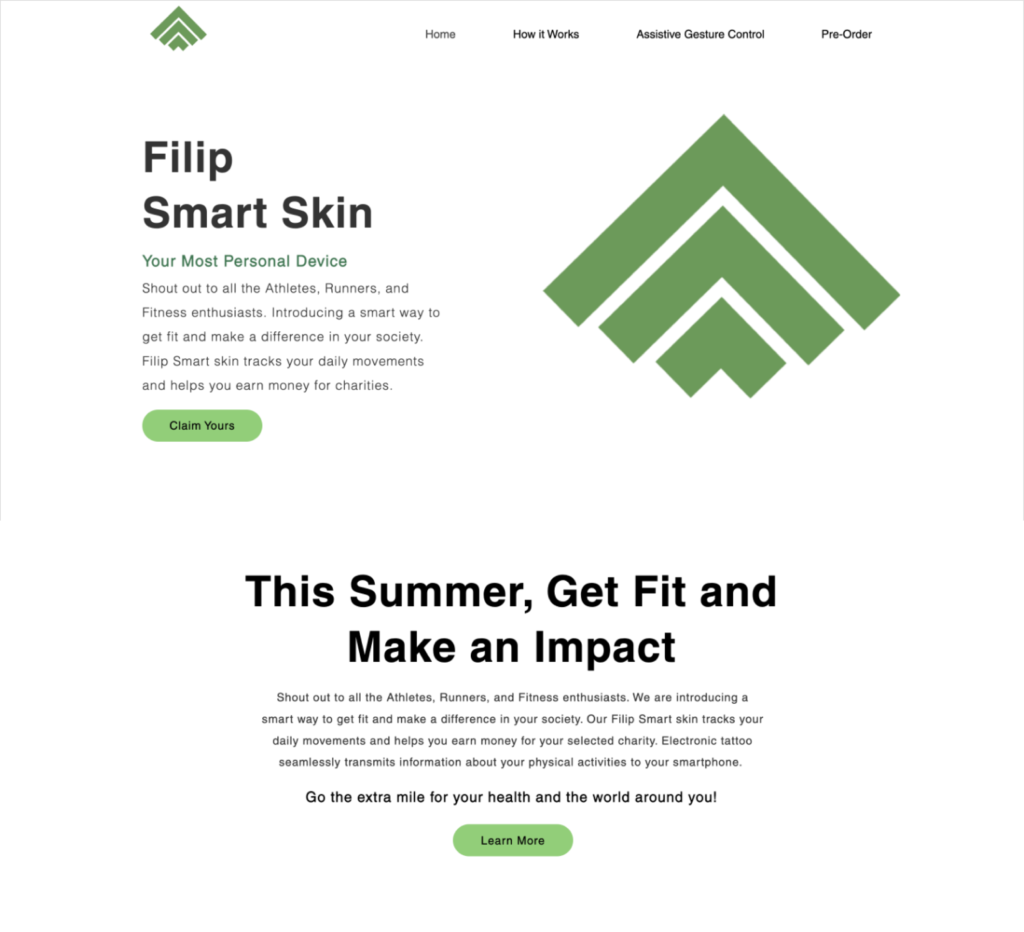
A pretotyping experiment involving a YouTube video and a product website is a method used to test and validate the viability of a product or idea before investing significant resources. In this experiment, I created a short video to showcase the product concept, its features, and potential benefits. The video is then shared on YouTube to reach a wider audience.
Simultaneously, a product website is created to provide additional information, details, and interactive elements related to the product. The website serves as a platform for users to explore the product’s functionalities, learn about its value proposition, and engage with the brand. Feedback and metrics gathered determine interest and potential demand for the product.
Risky Assumption
Users want a new way of tracking their fitness progress every day and will raise charity along.
Success criteria
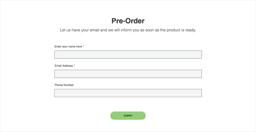
At least 2 of website visitors will provide their details for early signup.
Result
5 website visitors provided their details for early signup.
Key Takeaways
Having dived into Nir Eyal’s “Hooked” and applied its framework to design a habit-forming product that integrates charity into everyday life, I can vouch for its game-changing impact. The book delves into the psychology of user behavior and hands out practical techniques for creating captivating experiences. By following the trigger, action, variable reward, and investment principles, I crafted a concept that has the potential to deeply engage users and instill lasting habits. It’s been an exciting journey fueled by the wisdom of “Hooked.
Wasn't that insightful?
Thank you for taking the time to read my case study. However, there is much to learn on my design journey. Don’t miss the fascinating case study on Redefining drive-through accessibility for deaf and hard-of-hearing people.
