Can a person conveniently place an order into the ordering box without using their mouth or ears?
Considering the restaurant business, though research estimate that about 50 to 70 percent of fast food sales come from drive-throughs, however, there have been many incidents of discrimination at popular restaurant drive-throughs due to inaccessibility.
One major problem of inaccessibility for deaf individuals at drive-through restaurants is the reliance on audio-based communication. Drive-through systems often rely on speakers and microphones to facilitate communication between customers and restaurant staff, which can create significant barriers for deaf individuals who rely on visual communication methods such as sign language.
This can lead to misunderstandings, frustration, and delays in service, ultimately preventing deaf individuals from enjoying the same level of convenience and access to fast food as their hearing counterparts. Additionally, many drive-through restaurants have yet to implement accessible solutions such as video screens or visual aids to improve communication for deaf customers.
Problem Space
Drive-through service is a staple in American culture. To accommodate the fast-paced lifestyle that Americans have grown accustomed to, restaurants and other businesses routinely provide service via drive-throughs; however, for many deaf customers, challenges still arise with miscommunications and accessibility issues at drive-throughs. Deaf or hard of hearing receive and relay information differently than hearing people. While deaf and hard of hearing people may be able to voice words, others may not. Hence, drive-through services based on voice assistance can be meaningless to the deaf. Forcing this population to go inside an establishment to order is not a fair solution, especially since many restaurants close the inside of their restaurants at night but leave their drive-throughs open.
Understanding the users
Understanding that disabilities can be permanent, temporary, or situational in drive-through spaces, two majorly impacted user groups were ‘Deaf’ people who only use sign language and can’t speak or hear anything, and ‘hard of hearing’ people who use hearing aids or has an implant but they have a very different experience than hearing people.

Initial Project Goal
How might we reduce
the communication barriers for deaf and hard-of-hearing individuals at
drive-through restaurants?
A youtube video that mirrors the problem space
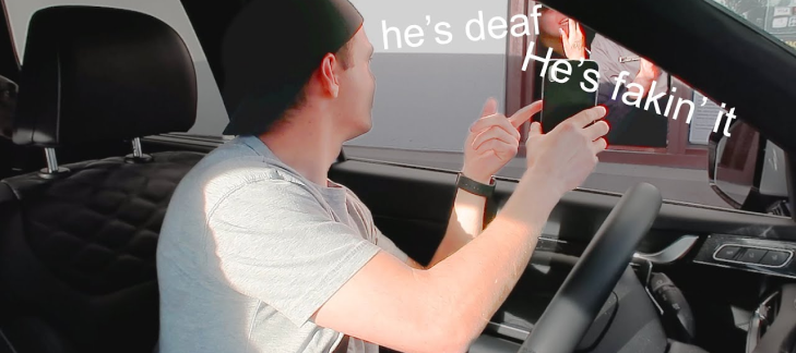
The YouTube video “Deaf Man vs. Drive Thru: They Threw Away My Food!” features a deaf man who attempted to place an order at a drive-through but was met with significant miscommunication and frustration. Despite trying to communicate his order through various means, including writing it down and using a mobile app, the employee was unable to understand his order correctly. Eventually, the employee threw away the man’s food and refused to provide a refund or replacement. The video sheds light on the challenges that the deaf community faces when trying to navigate drive-through experiences and highlights the need for greater accessibility and understanding in these settings.
Why is this problem important?
The primary reason that drive-throughs to be accessible to the deaf population is the Americans with Disabilities Act (ADA).
ADA, a federal law passed in 1990, forbids discrimination against those with disabilities and outlines the accommodations that must be given to all people with disabilities, including those who are deaf or hard of hearing.
By solving this problem, Businesses will avoid tricky situations and possible lawsuits for denial of service and discrimination.
According to the Global drive-thru food market report 2022

Scale of the problem
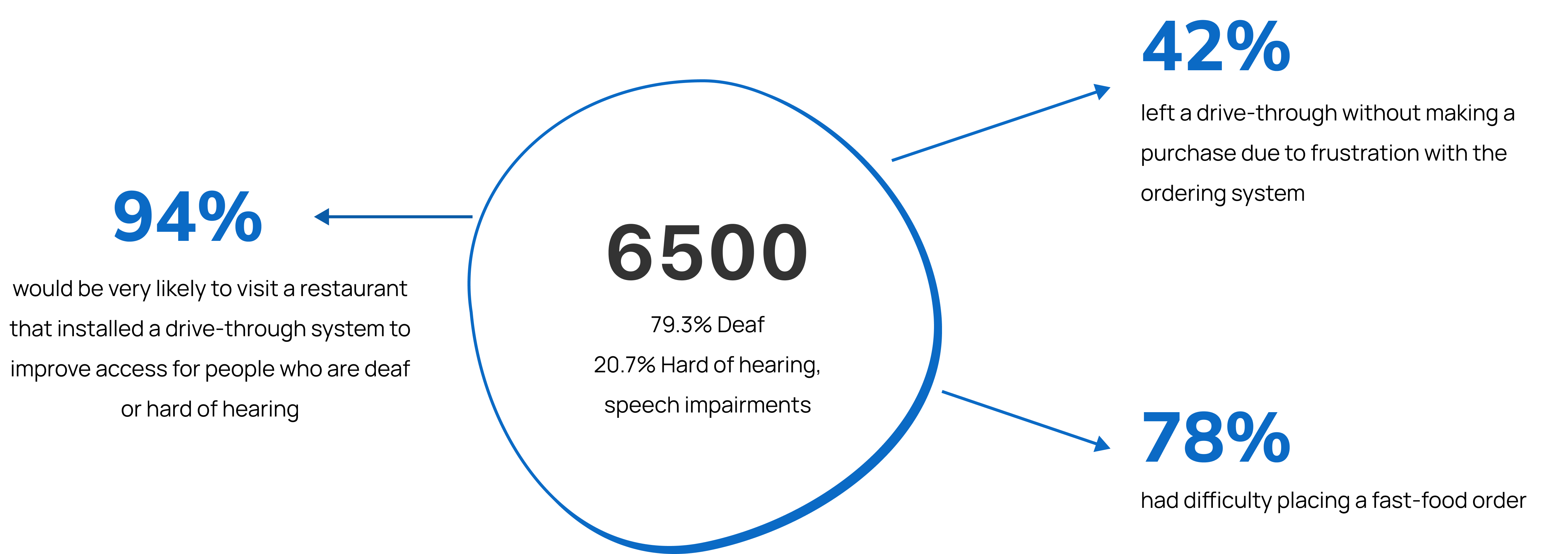
According to a survey conducted by Inclusion Solutions, 78% of participants of the 6500 deaf or hard-of-hearing people surveyed have had difficulty placing a fast-food order and a further 42% have left a drive-thru without purchasing due to frustration with the ordering system.
User research interviews
Identifying research goal
01 Understand the user’s current drive-thru habits/ordering practices.
02 To map the pain points of previous bad experiences of the user at drive-thru.
03 Learn more about the usage of drive-thrus and specific needs related to the deaf population.
04 To measure the impacts of the current solutions to the problem.
05 To determine the magnitude of the problem.
Recruiting interview candidates
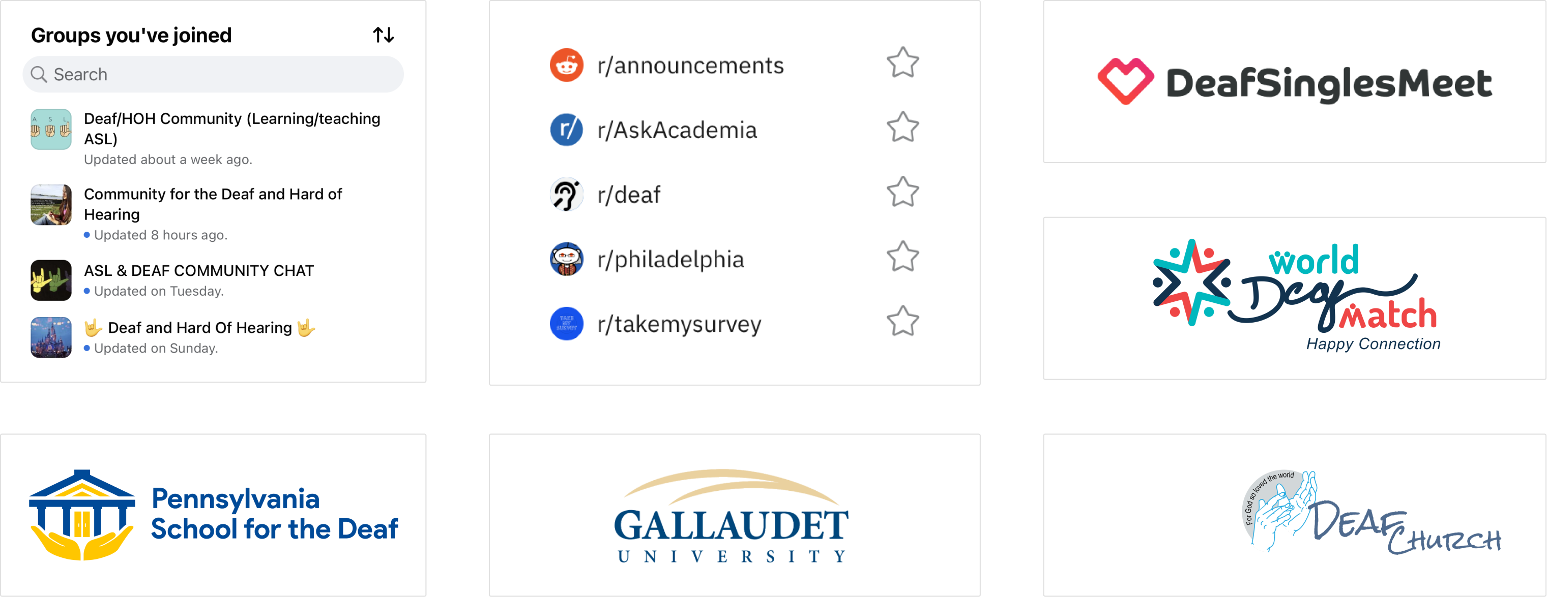
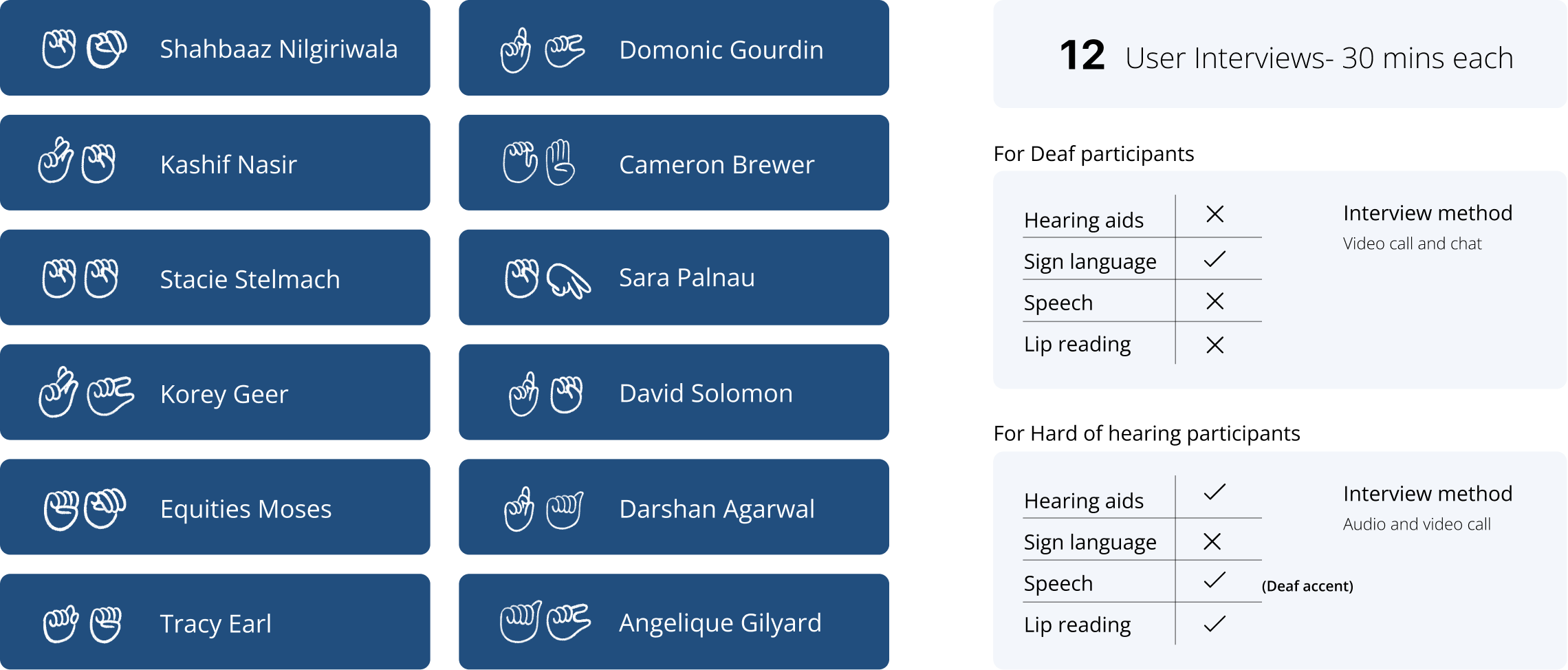
In my primary research, I interviewed 12 Deaf people with goal to learn about their current practices at drive-thrus as well as their pain points, needs, and goals along the way. Deaf dating websites, Deaf schools and universities, Deaf churches, Facebook groups, and the Jefferson Deaf ASL club were among the recruitment channels.
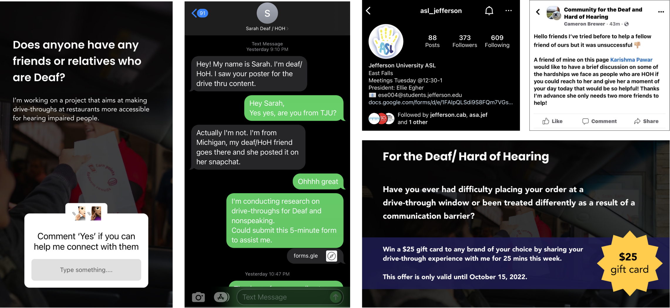
Spreading the word to recruit candidates
I promoted it on my social media accounts, and I also put up posters around campus and in prominent downtown locations, offering incentives for a 30-minute interview if the user meets the criteria. And the reactions were amazing. The most difficult, yet most rewarding, aspect of the research was interviewing them.
Understanding the candidate types
Interview debriefs
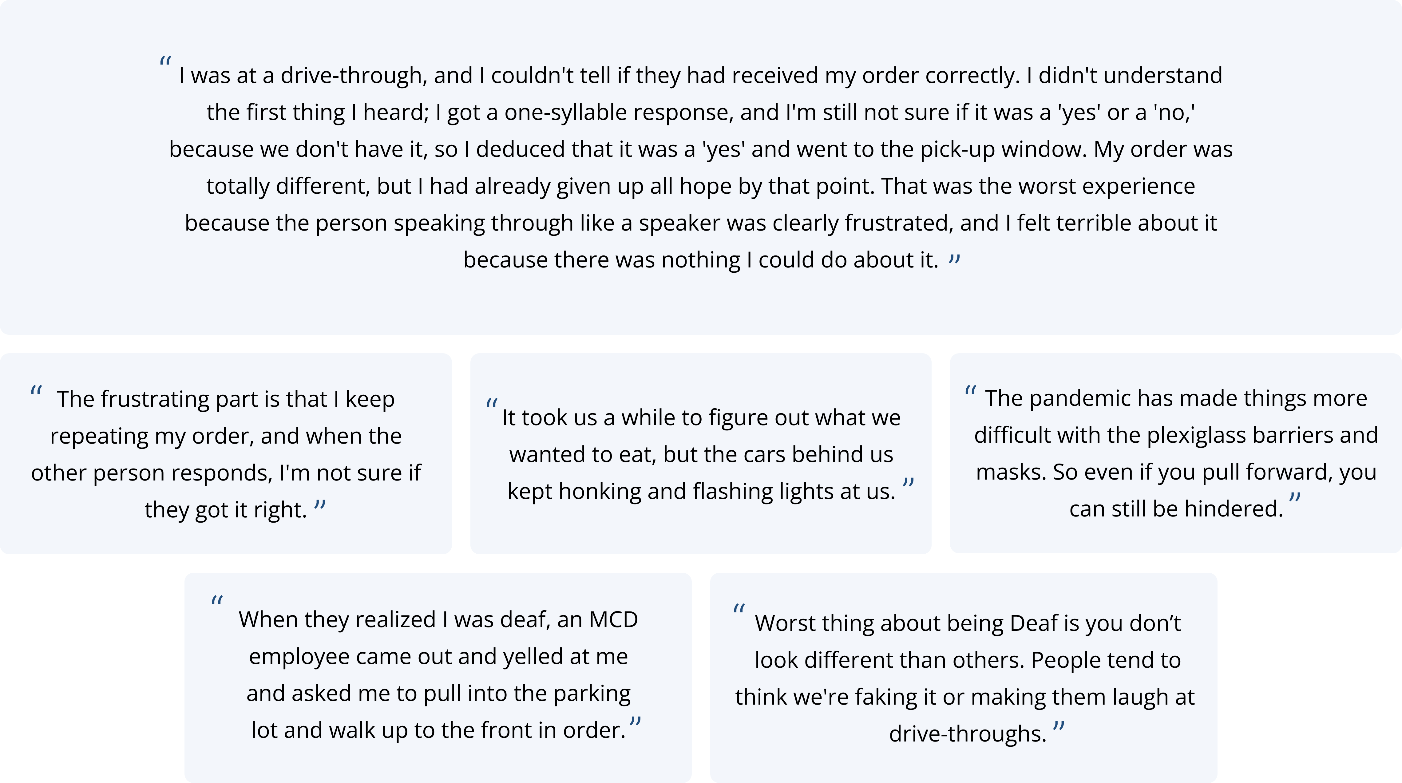
I conducted a thorough debriefing to reflect on the data from each interview and their experiences some of which were quite horrific.
In their own words
"It seemed that I didn't know anything about our users until now."
Affinity mapping
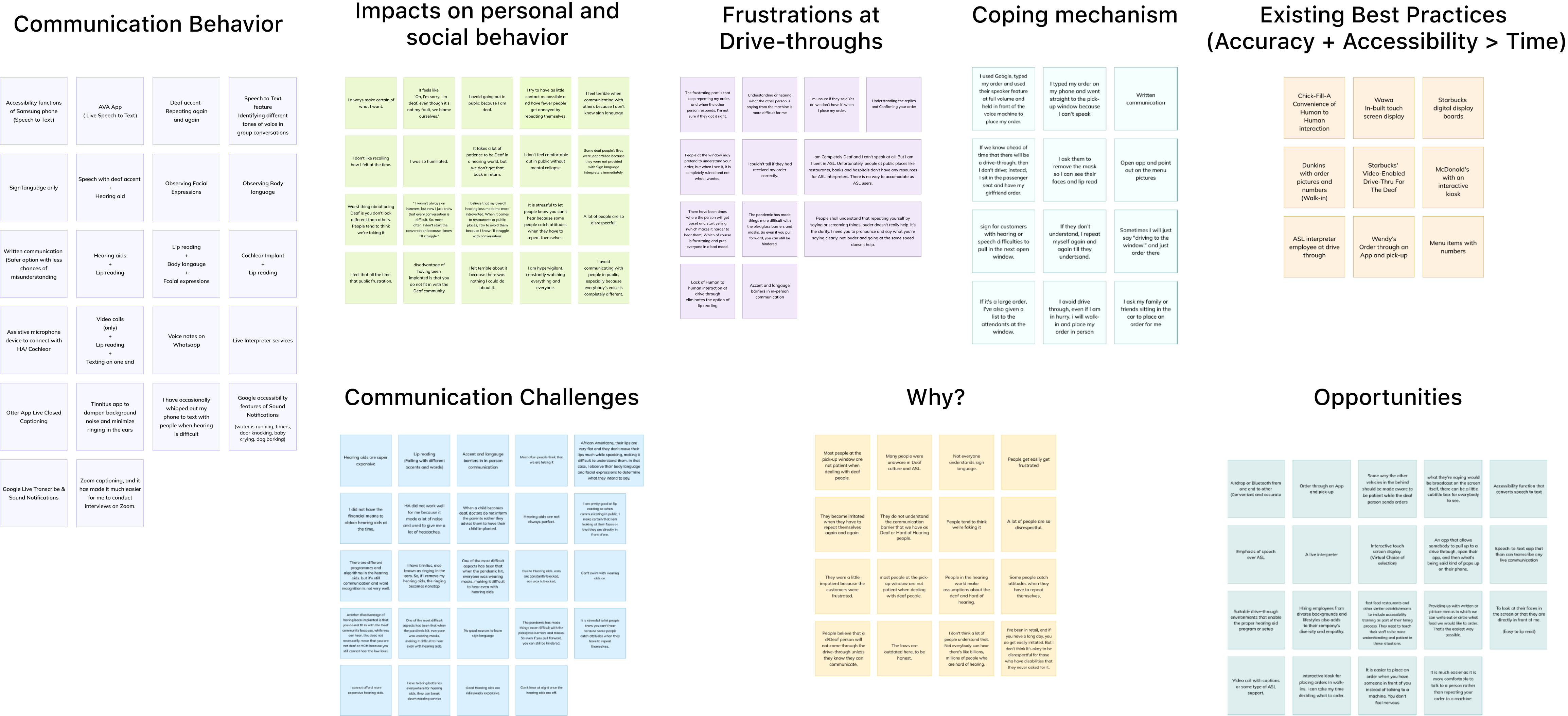
Using affinity mapping, I organized all qualitative data into similar themes such as communication behavior, impacts, frustrations, coping mechanisms, existing best practices, and opportunities.
Coping mechanism
Avoiding the speaker box and using notes, pen, and paper to write down the order and hand it to the person at the pick-up window are two common coping strategies. Another intriguing technique is text-to-speech, in which one person used Google, typed his order, and translated to use their speaker feature at a high volume and held it in front of the voice machine to place his order.
Some people avoid the whole situation by asking their friends to order on their behalf.

Competitive analysis
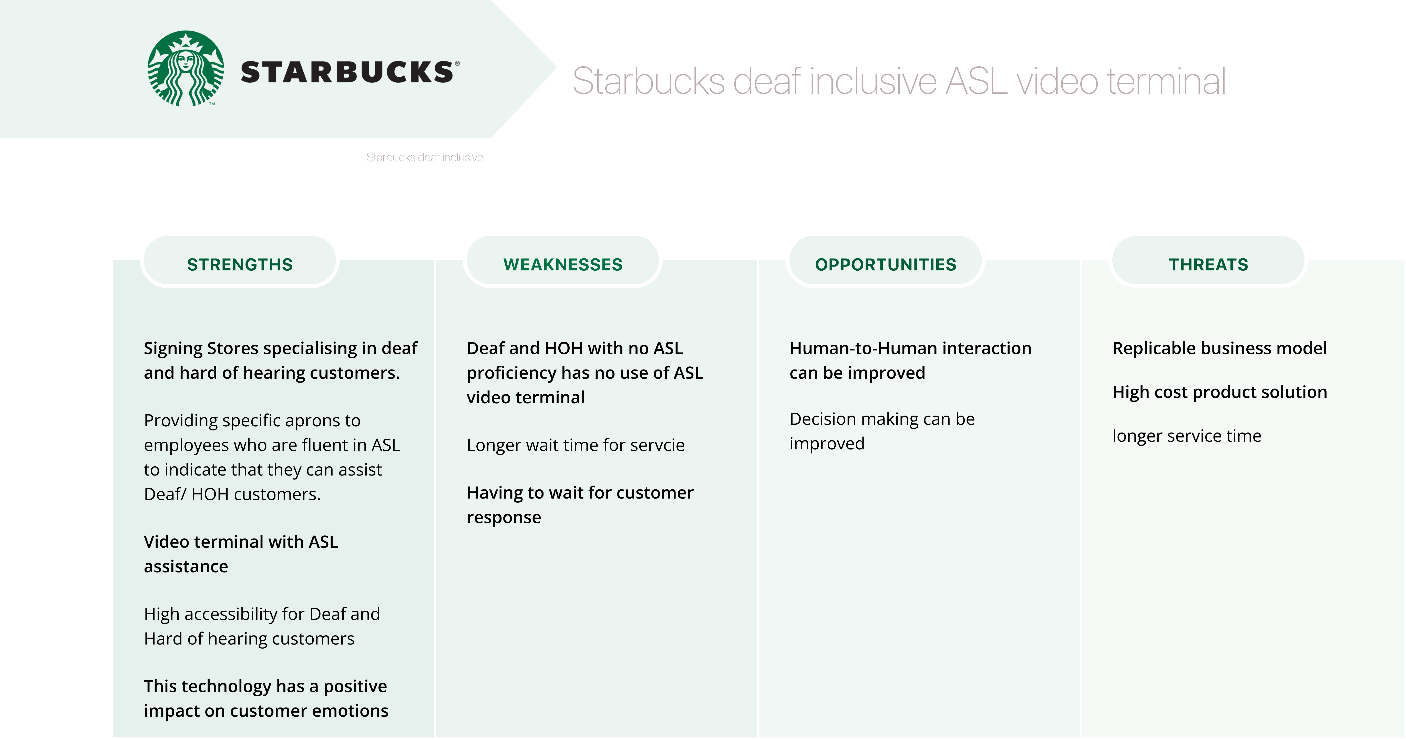
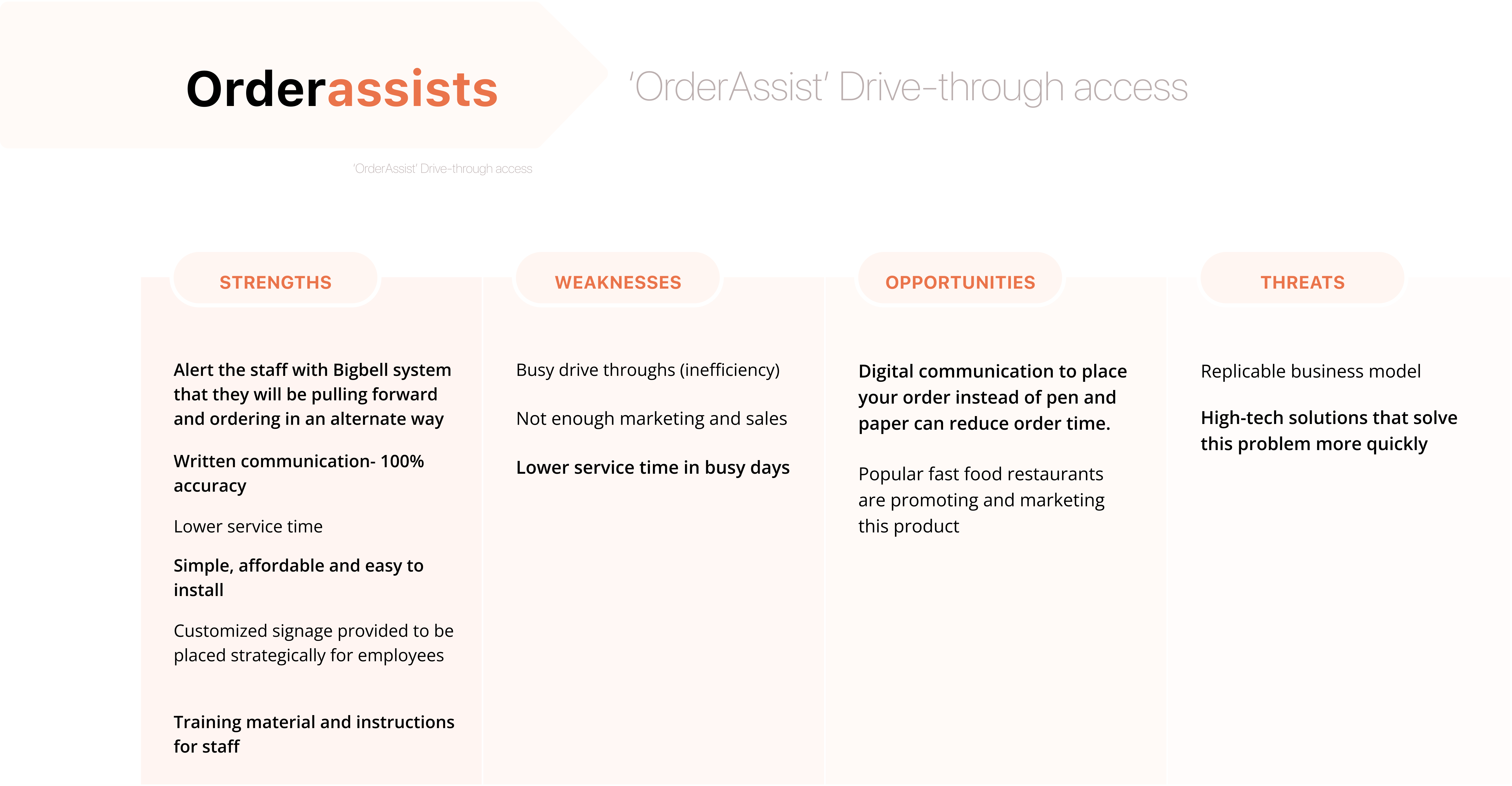
Further, Interview participants also talked about some of the currently used best drive-thru techniques.
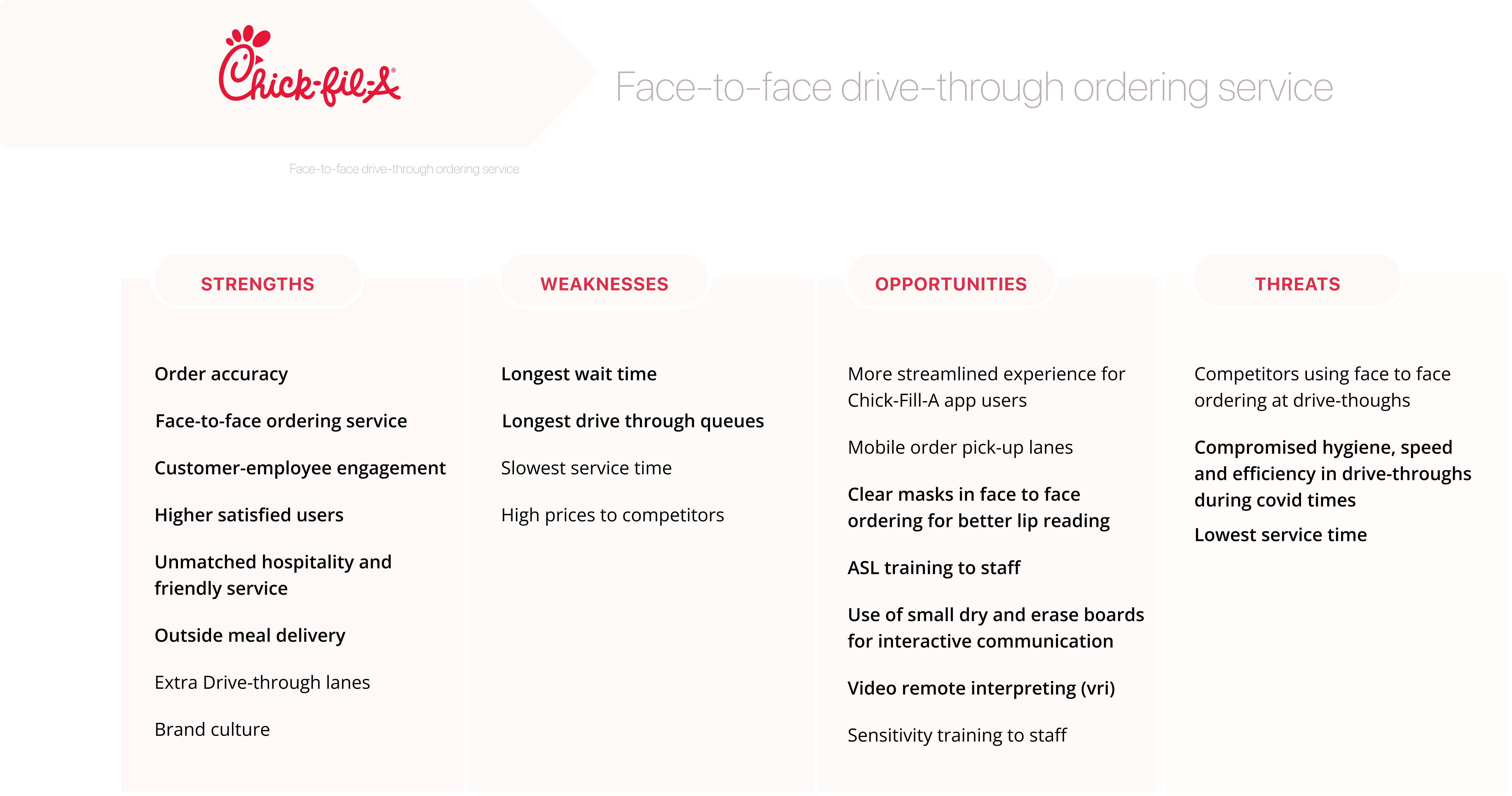
Chick-fil-A’s face-to-face ordering system made it the most accessible drive-thru for the Deaf. Though Chick-fil-A did not initiate this with accessibility in mind but rather to promote more hospitable service. It helped Deaf people in order confirmation and resulted in the highest order accuracy and highest satisfied users.
Service slice
I used service slices to sketch experiences and diagrammatically represent complex ideas in simpler ways to further make sense of data. My goal was to focus on a specific touchpoint, in this case, the ordering process, to better understand and empathize with the crafting experience through each of these four lenses.

Service slices
Behavior & Information exchange
The first slice is the behavior and information exchange of a deaf person ordering at a drive-thru restaurant and struggling through it. It depicts what people do and the information shared during a drive-thru service experience.
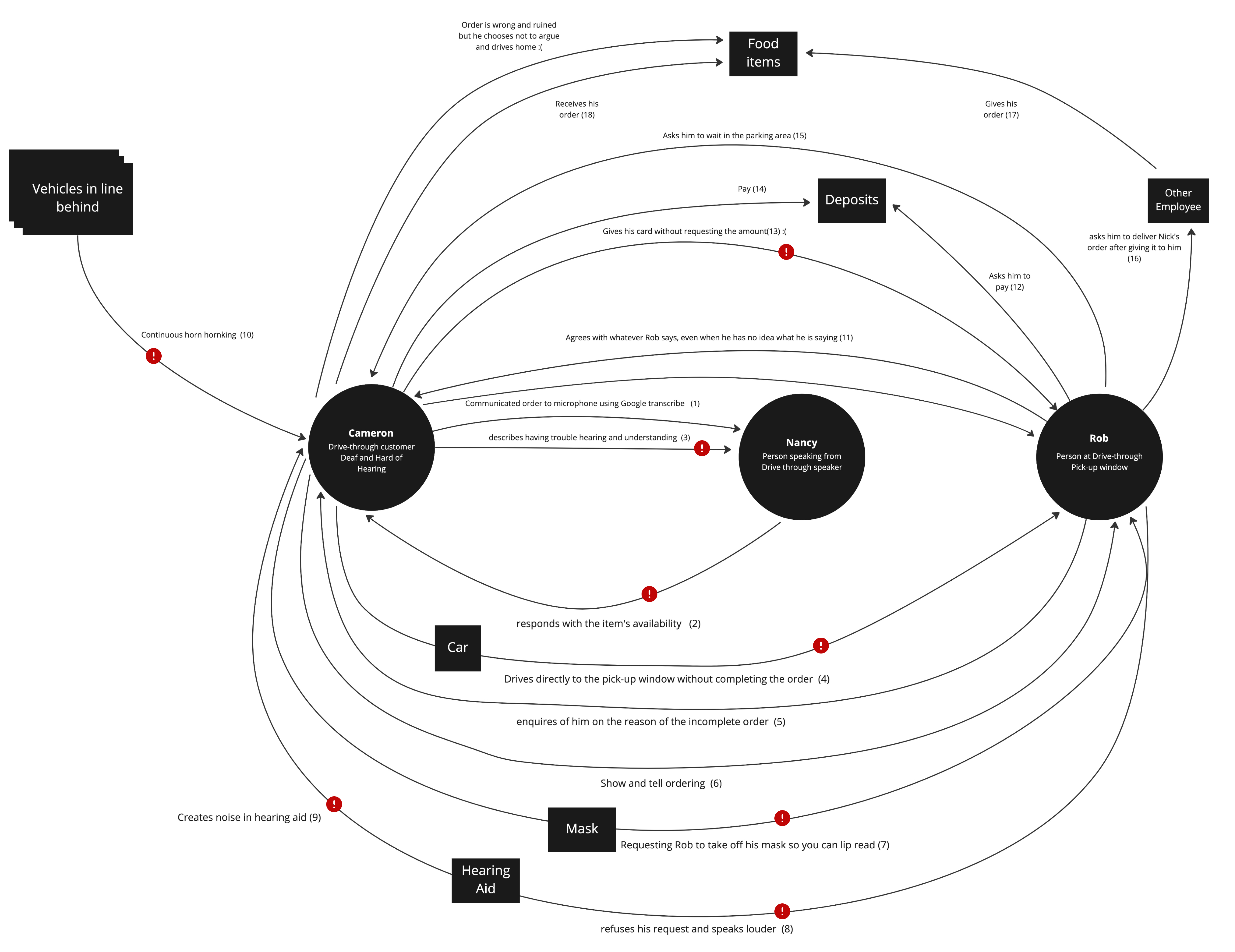
These three circles represent three coordinated entities: the first is a deaf person ordering at the drive thru, the second is a person speaking from the drive-thru speaker, and the third is a person at the pick up window. This only describes their behavior and information exchange, and at the end I have placed small red circles with exclamation marks to indicate breakdowns or places where something went wrong. For example, when a deaf person tries to communicate with an employee at the pick-up window and informs them that he is deaf, the employee refuses his requests and speaks louder, causing a lot of noise in the deaf person’s hearing aid.
Power, Policy, Influence, and Emotion
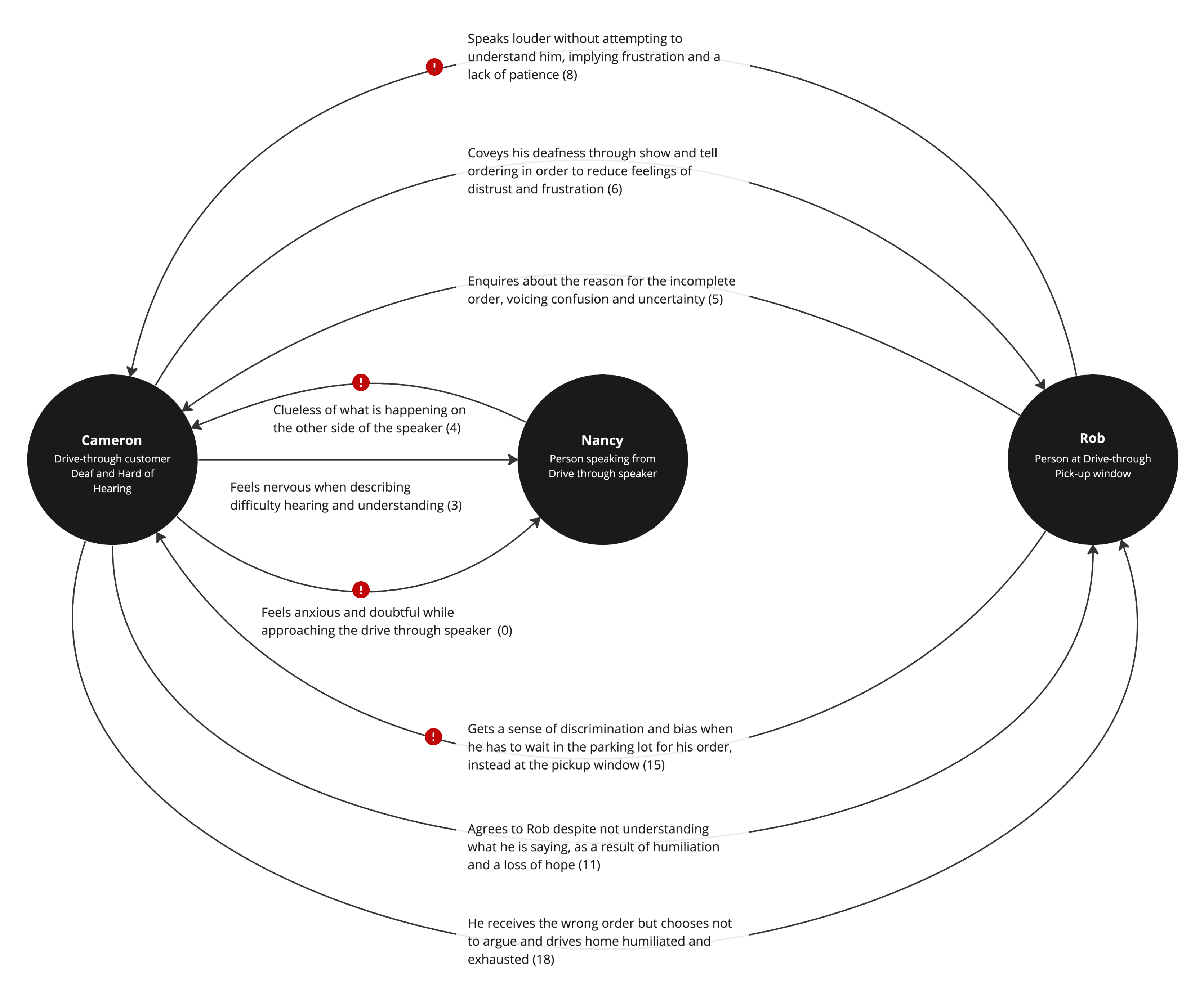
The second slice is referred to as power policy, influence, and emotion. It features the same people, but this time I’m mapping how people feel and the power dynamics that exist between them. For example, when a person at the pickup window speaks louder, it demonstrates frustration from having to repeat himself as well as a lack of patience, making the deaf person more anxious and taken back. and an exclamation mark indicates that something needs to be fixed here.
Artifacts
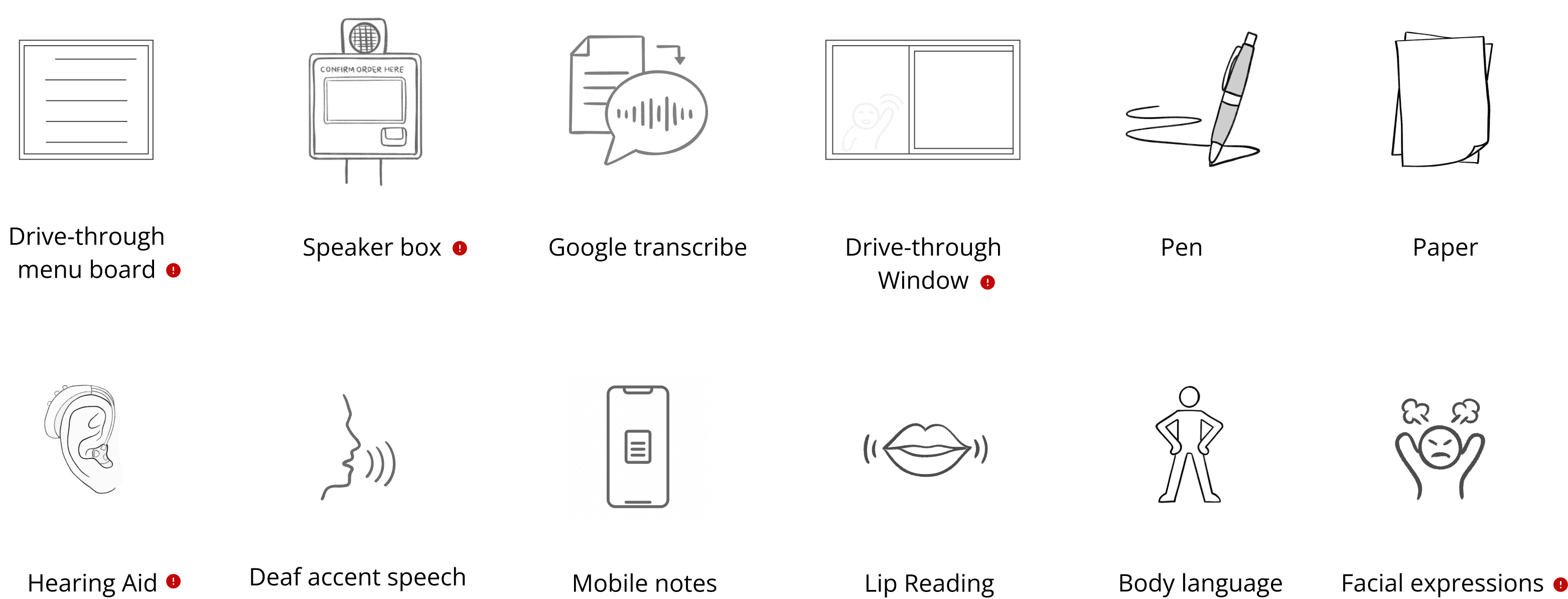
The third slice is artifacts, which show items both physical and digital that are used throughout the service experience.
This displays all of the items that a deaf person encounters when visiting a drive-thru. For example, the pandemic has made things more difficult with plexiglass barriers and masks at pick-up windows. So, even if a deaf person pulls forward to the pick-up window, it becomes difficult to convey the order, and thus it has a red mark.
Environment
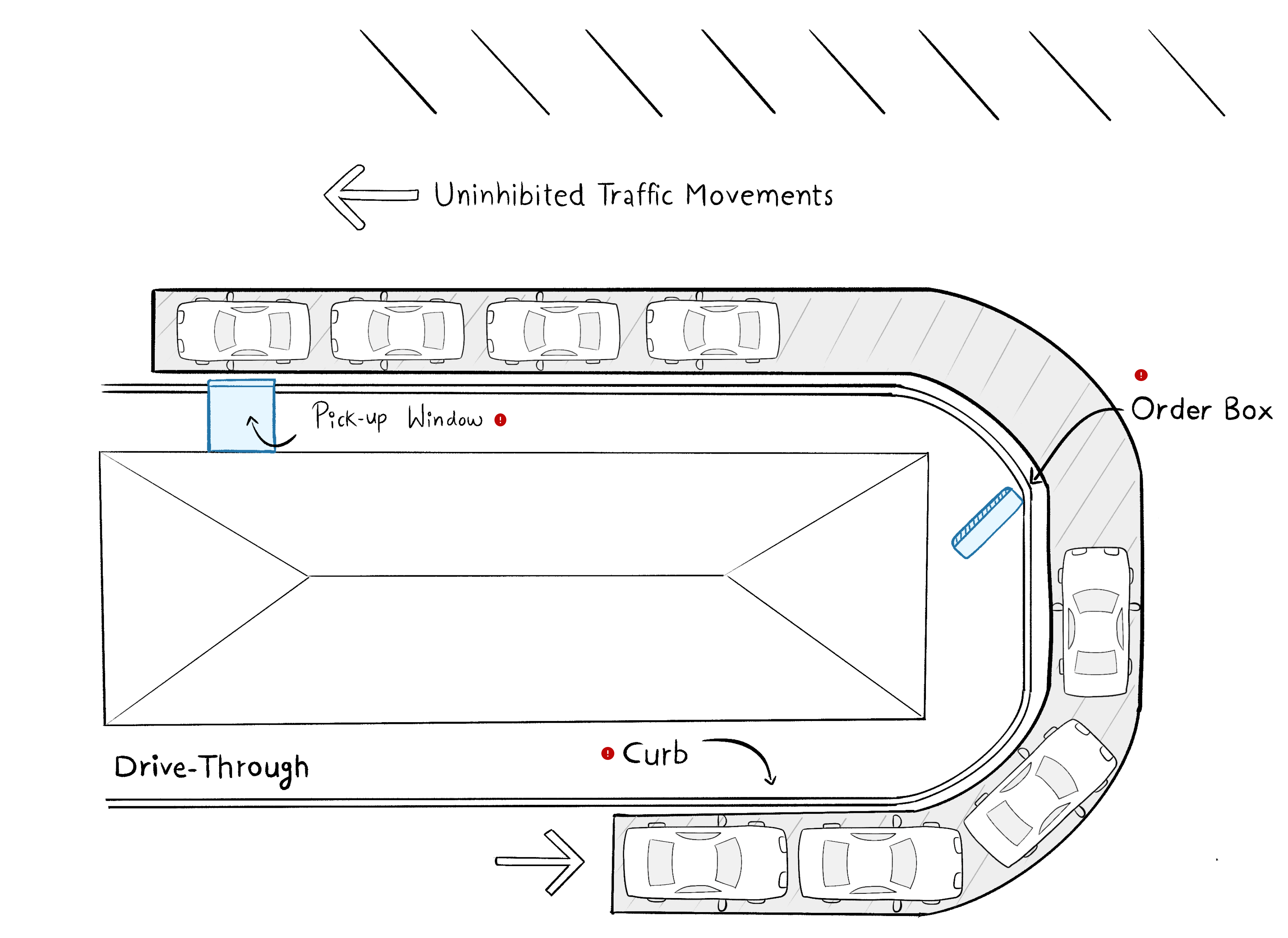
The final slice is the environment, such as a bird’s eye view of a drive-thru and what happens in the environment. There is a long line of cars at the curbside, as well as an order box and a pickup window.
Zooming-in
Problem statement
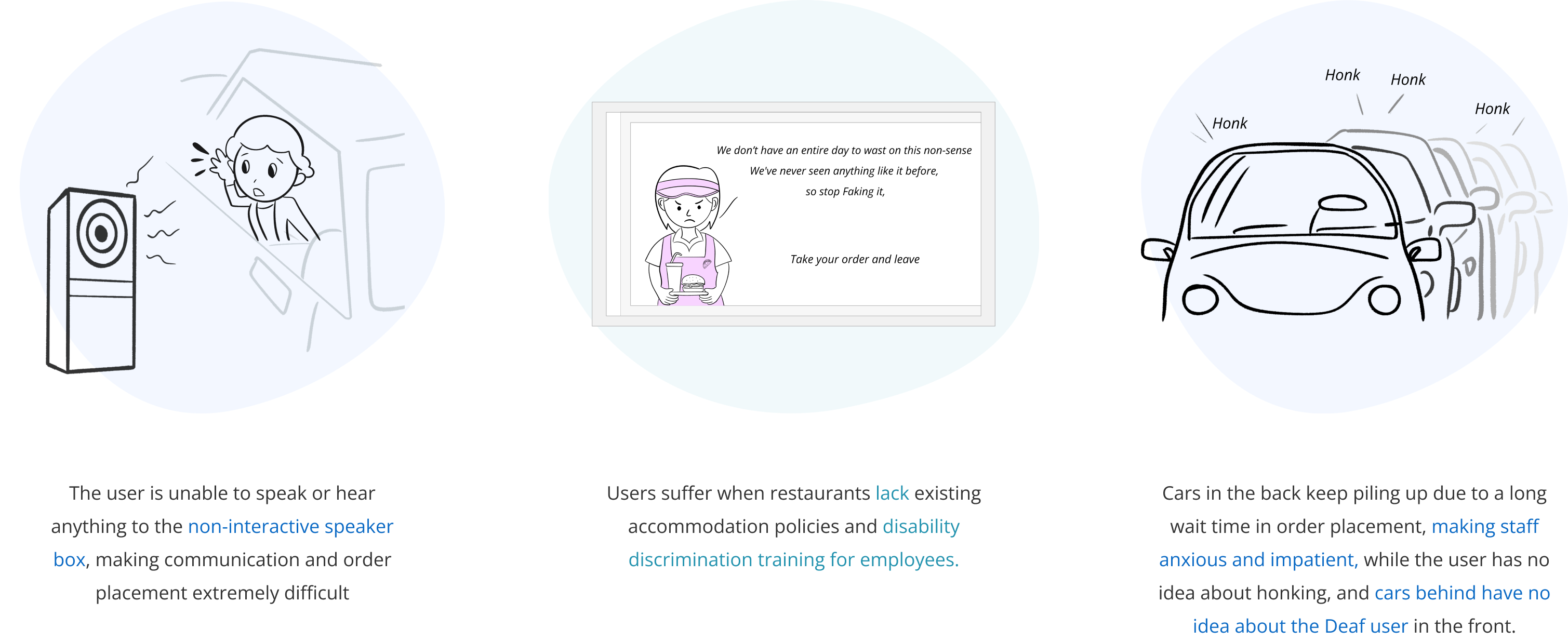
Drive-thru service is a staple in American culture.
To accommodate the fast-paced lifestyle that Americans have grown accustomed to, restaurants and other businesses provide service via drive-thrus. Considering the restaurant business, researchers estimate that about 50 to 70 percent of fast food sales come from drive-thrus, but there have been many incidents of discrimination at popular restaurant drive-thrus due to inaccessibility. According to a survey conducted by Inclusion Solutions, 78% of the 6500 deaf or hard-of-hearing people polled had difficulty placing a fast-food order, and 42% had left a drive-thru without purchasing due to frustration with the ordering system.
The ‘National Institute of Deafness and other Communication Disorders estimates that 30 million Americans, or 13% of the US population, have some form of hearing impairment, ranging from hard of hearing to deafness. The primary reason that drive-thrus be accessible to the deaf population is the Americans with Disabilities Act (ADA), a federal law passed in 1990, that forbids discrimination against those with disabilities and outlines the accommodations that must be given to all people with disabilities, including those who are deaf or hard of hearing.
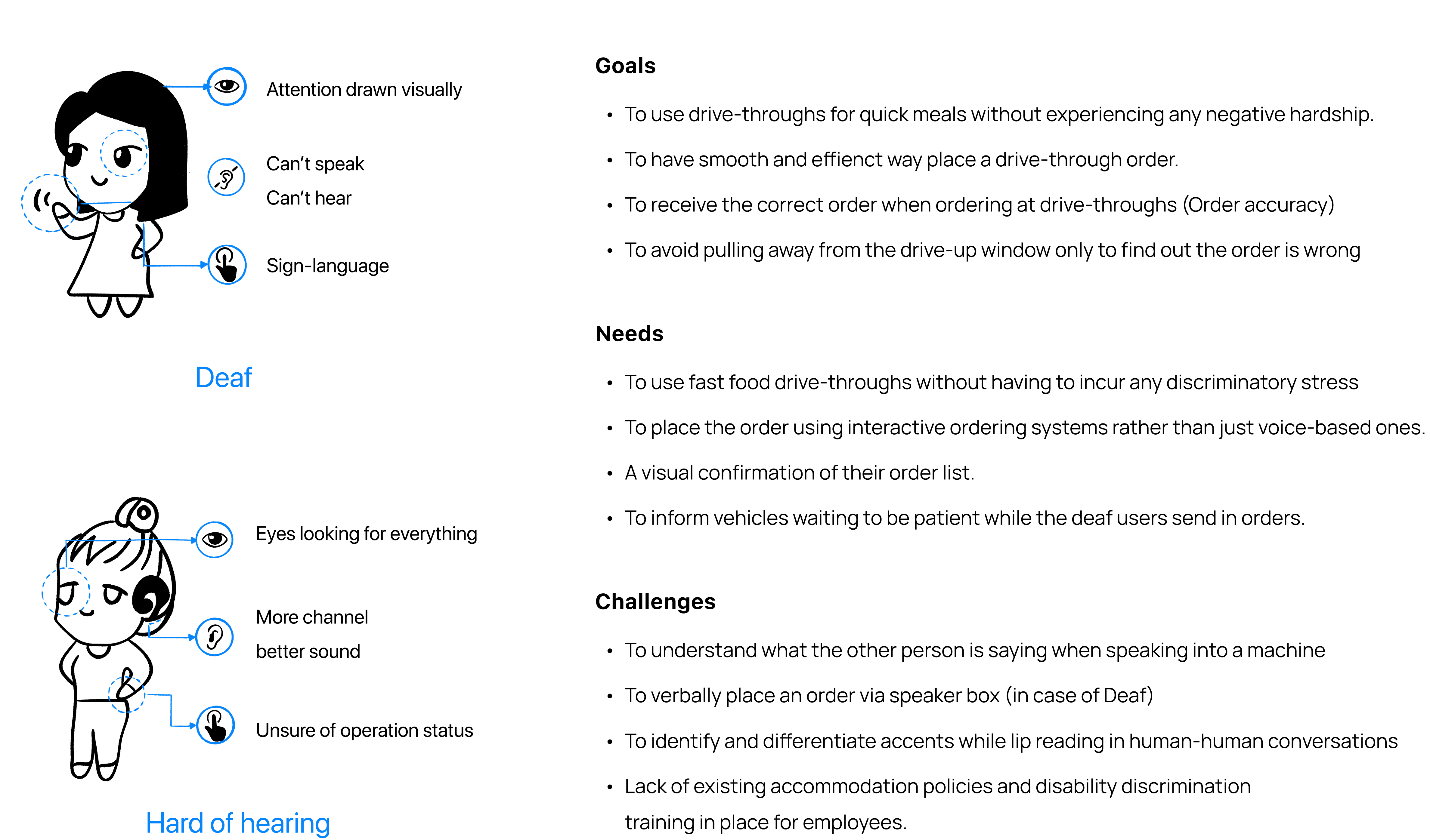
The user’s goal is to use fast food drive-thrus like anyone else, without incurring discriminatory stress. Ordering food at a drive-thru ranks high on the list of frustrating experiences.
They feel anxious not just because of the complexity of the conversation, but also because more cars continue to pile behind them during the slower-than-usual order process.
Thus, users require the staff at the drive-thrus to be patient and considerate when dealing with deaf individuals. Simultaneously, other vehicles waiting behind should be made aware to be patient while the users send in orders.
Inclusion Solutions have been working on this topic for almost 8 years and have had minimal success in getting the market to accept its simple approach to solving this problem.
Solving this issue would provide speech and hearing-impaired users with equal accessibility at drive-thrus, while businesses would benefit from a more streamlined ordering system. Furthermore, they will avoid tricky situations and potential lawsuits for service denial and discrimination.
Needs, Goals, and Challenges

Storyboard
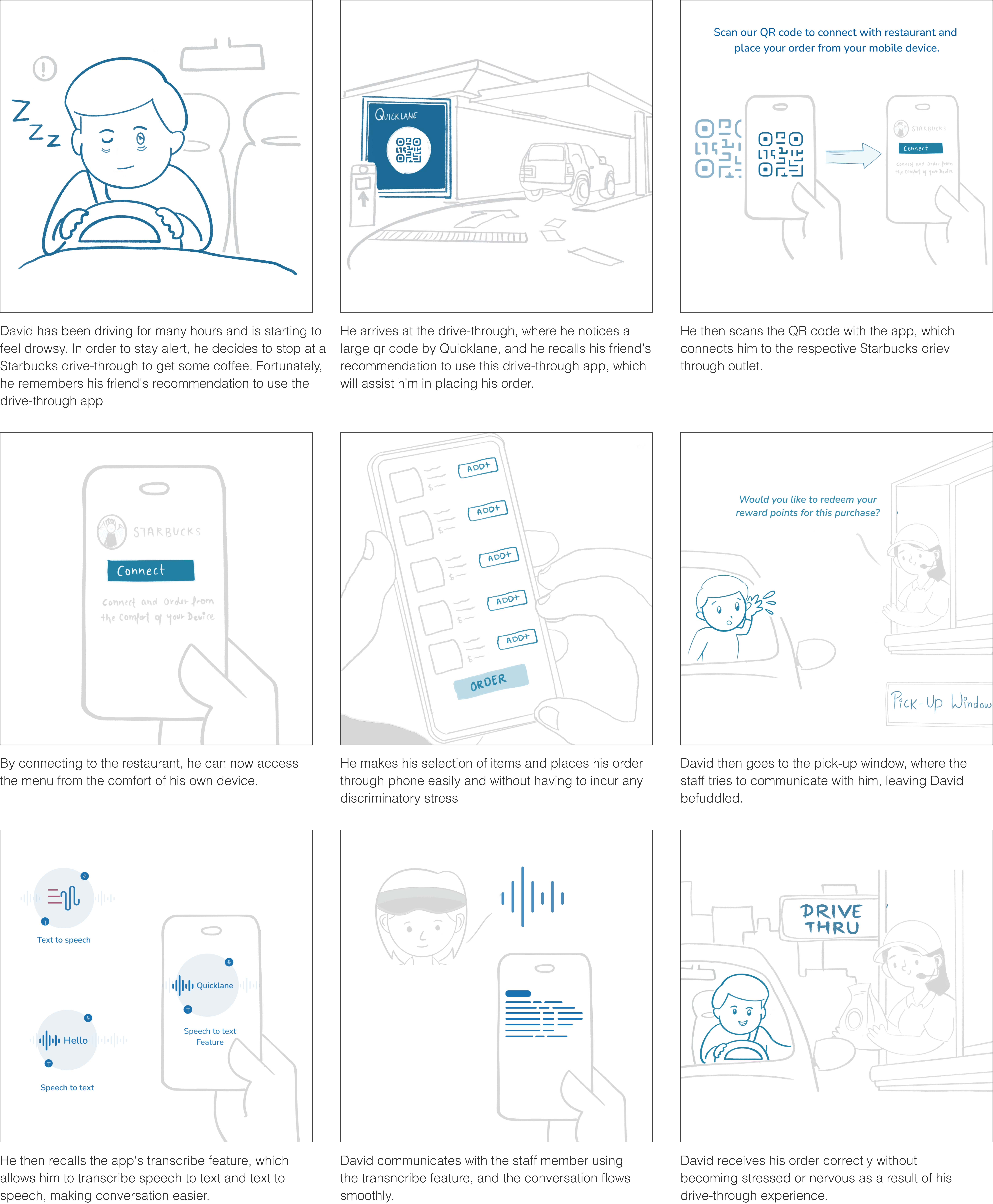
One of the major challenges in UX/product design involves taking a nebulous problem and turning it into an actionable solution. My first step in this approach was creating a storyboard, a simple yet powerful tool.
Scoping
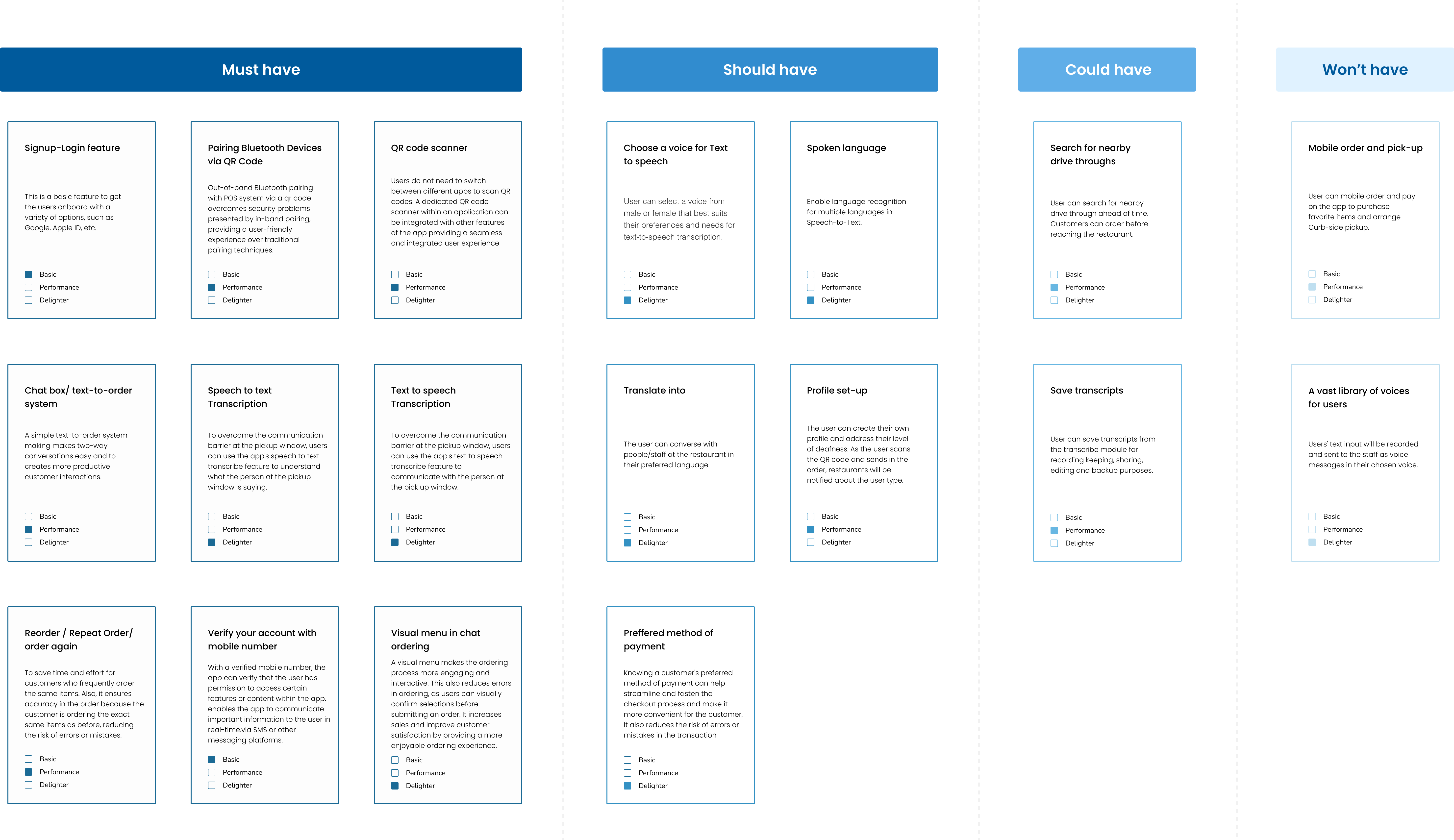
Given the complexity of the problem, scoping becomes particularly important to ensure that I am not over-committing myself. I chose to create a cupcake instead of a wedding cake. A cupcake represents the desired MVP – a complete, but not overly complicated product. To narrow down my solution, I employed the MSCOW method.
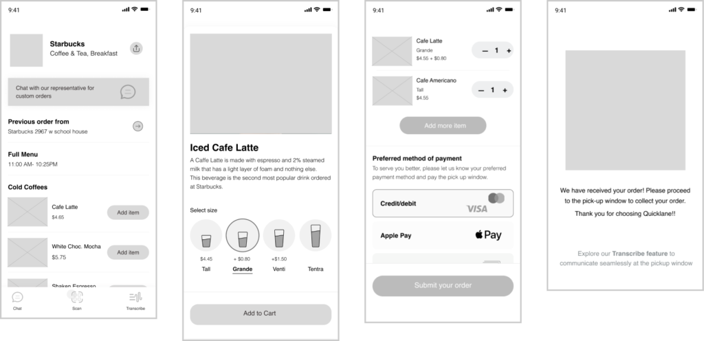
Skeleton- Wireframes
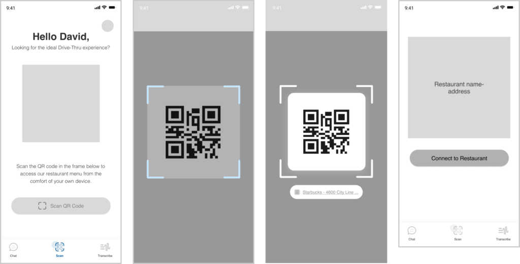
Scan QR Code feature
Add Your Heading Text Here
Visual style
Moodboards
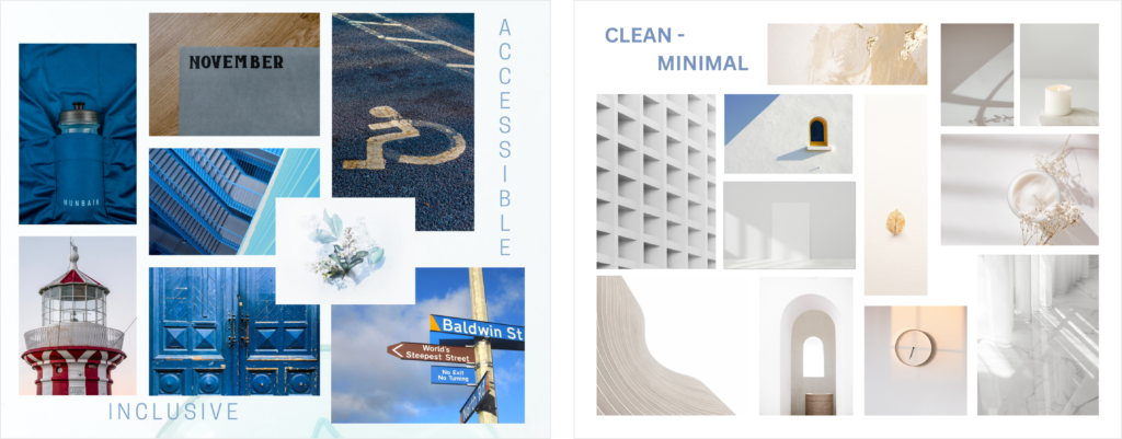
I sought inspiration in developing my visual identity by creating mood boards based on three relevant words:
Accessible, Clean, and minimal. Here are my two favorite mood boards from this exercise, which helped me nail down my color scheme. As my app is focused on accessibility, I chose blue as the primary color to convey trust, confidence, and inclusiveness, while keeping the design simple and monochromatic to emphasize equal access and support.
Surface - Branding
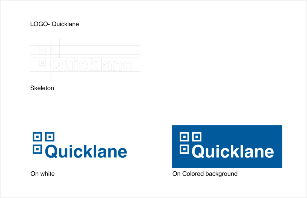
The logo for “Quicklane” combines the QR code icon and the app name, representing its main purpose of streamlining the drive-thru ordering process using QR codes. The sharp-edged QR icon adds an edgy look to the design, while the app name “Quicklane” clearly communicates its purpose of providing fast drive-thru assistance to customers.
Accessibility Guidelines
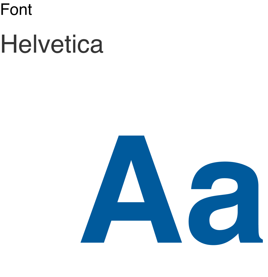
Font
In selecting a font for Quicklane, I considered several factors such as readability, simplicity, and compatibility with the app’s design. After researching the most accessible fonts commonly used in digital media, including Tahoma, Calibri, Helvetica, Arial, Verdana, and Times New Roman, I ultimately decided on Helvetica. Helvetica is known for its clean lines and simple, efficient design. Its sans-serif typeface provides a modern and sleek appearance that is both elegant and minimalistic.
Additionally, Helvetica is often considered a “neutral” design that can be used with a wide range of content without distracting from it. This quality is particularly important for Quicklane, which aims to provide clear and concise information to its users without any unnecessary distractions or visual clutter.
Contrast
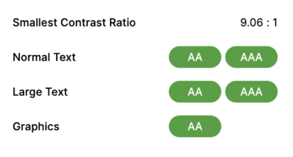
The AA and AAA guidelines require a minimum contrast ratio between a website’s text and background colors, with AAA being the more stringent standard. In designing Quicklane’s content, I ensured that it was easily readable for users with varying color vision abilities and in different viewing conditions. To avoid relying solely on color to convey meaning, I used a combination of color, text, and symbols to communicate information.
Understandable
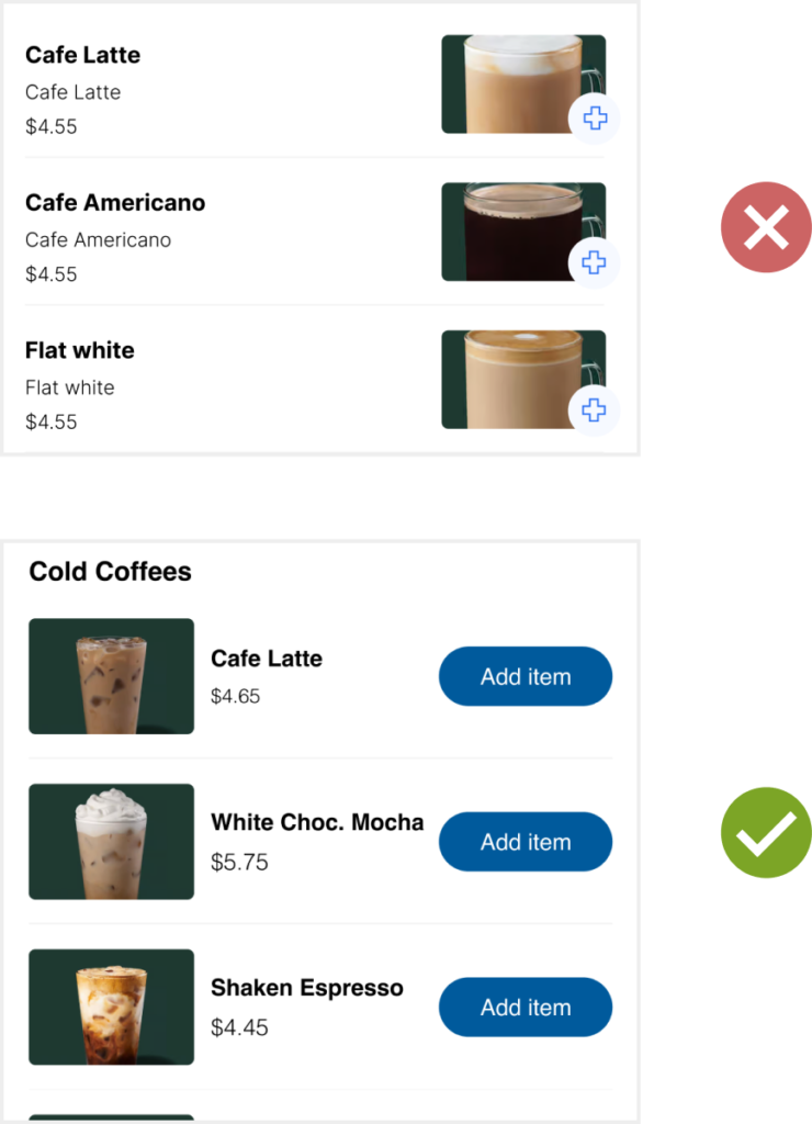
Use clear and simple language:
To ensure that the information and instructions provided in my deaf application are easily understood by as many members of the deaf community as possible, I used plain language that is easy to understand and avoided jargon, technical terms, or complex words.
This is important because many deaf individuals use sign language as their primary language and may not have had the same exposure to English as their hearing peers. By using simple English, all users are able to benefit from the application’s features and functionality.
Perceivable
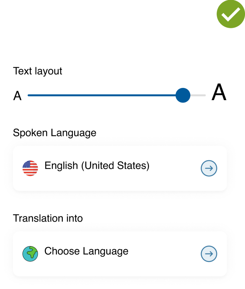
Use clear and simple language:
The content on the page/screen is designed to be perceivable by all users. Since deaf individuals rely on visual and tactile cues to perceive information and may not have access to auditory information, alternative methods are provided to ensure effective use and access to the content in the application.This is important because many deaf individuals use sign language as their primary language and may not have had the same exposure to English as their hearing peers. By using simple English, all users are able to benefit from the application’s features and functionality.
Style Guide

Prototype
The onboarding process of your drive-thru ordering app is designed to be a smooth and user-friendly experience for the user. The onboarding process is intuitive and easy to follow, allowing the user to quickly and easily access the app’s features and begin using the app to place their drive-thru orders.

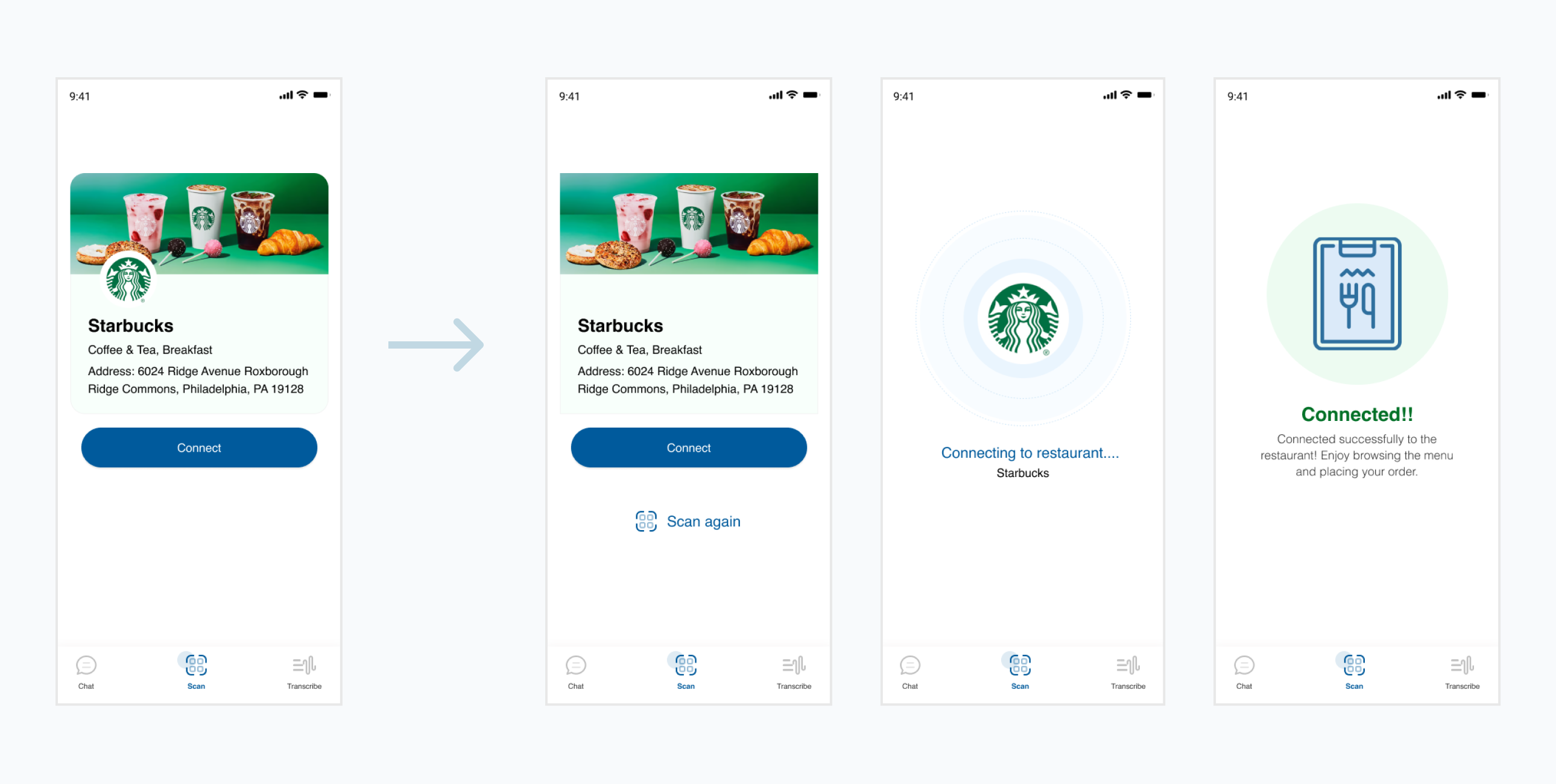
The “Scan QR Code” feature is an essential part of the drive-thru ordering app, designed to provide a seamless and accessible ordering experience for deaf and hard of hearing individuals. With this feature, users can scan a QR code placed at the entrance of the drive-thru using their phone’s camera. The app then automatically connects the user to the restaurant’s ordering system, where they can browse the menu and place their order. This feature eliminates the need for traditional ordering methods, such as voice communication, which can be challenging for individuals with hearing impairments.

The chat feature in the drive-thru ordering app is a chatbot that provides users with real-time assistance in placing their order. When a user opens the app and selects the “Chat” feature, the chatbot initiates a conversation with them, offering help in placing an order. The chatbot provides a list of menu items, specials, and promotions that are currently available. The user can select the items they want to order and customize their order as needed through the chatbot interface.

The “Scan QR Code” feature is an essential part of the drive-thru ordering app, designed to provide a seamless and accessible ordering experience for deaf and hard of hearing individuals. With this feature, users can scan a QR code placed at the entrance of the drive-thru using their phone’s camera. The app then automatically connects the user to the restaurant’s ordering system, where they can browse the menu and place their order. This feature eliminates the need for traditional ordering methods, such as voice communication, which can be challenging for individuals with hearing impairments.

Quicklane’s Mission
To create a seamless and enjoyable drive-through ordering experience for the deaf community.
Business Canvas Model
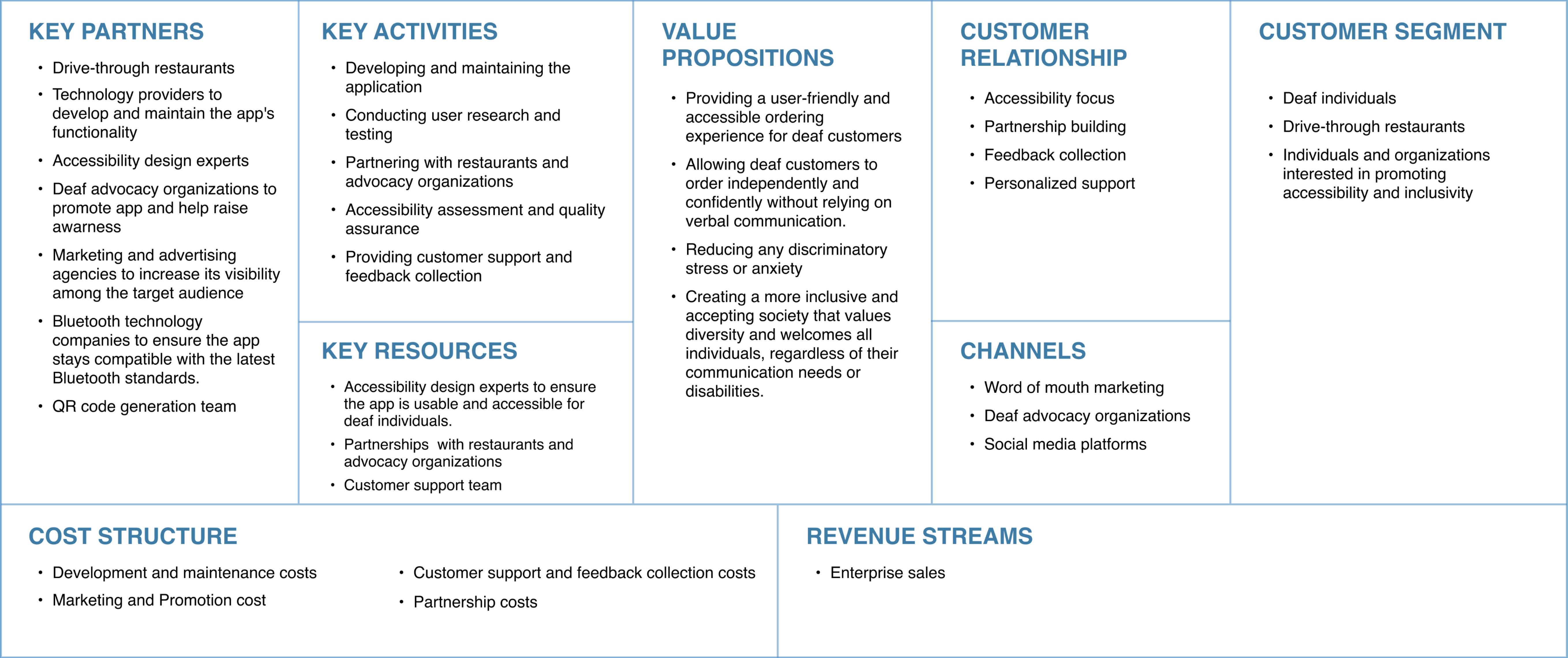
Using the Business Model Canvas helped me understand the important parts of my business plan, such as value proposition, consumer groups, critical partners, and income streams. It gave a clear and comprehensive depiction, which helped with analysis, improvement, and the generation of new growth ideas. In addition, the canvas helped in a successful presentation of my business plan to stakeholders. Similarly, by clearly showing the user experience of the product application, I was able to uncover user obstacles, improve design intuitiveness, and facilitate seamless communication with stakeholders and developers.
Growth Strategy- Quicklane 2.0
Geofencing
Quicklane’s growth strategy involves implementing geofencing technology to enhance drive-thru access and user experience in Quicklane 2.0. By creating virtual boundaries around the restaurant’s location and leveraging location-based services, customers will receive notifications when they enter the designated area, encouraging them to utilize the convenient drive-thru service.

Usability testing
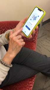
As part of our development process, we conducted user testing to gather feedback on the features and prototypes of our application, Quicklane. For this testing, we opted for a moderated usability test with 5 participants who tested the high-fidelity prototype in a real-time interview. To ensure that our participants matched our user personas and empathy maps, we recruited three people who had also participated in the research phase. One of the testers was an older individual to test the app’s usability for non-tech savvy users. In addition, we sought expert feedback from a UX Designer. Throughout the testing, we carefully prompted users to complete tasks without revealing the exact order of actions required to get from point A to point B.
Defining Testing Objectives
- To identify any usability issues that may arise during the use of the app, and to gather feedback from users on how to improve the user experience.
- To assess the app’s ease of use, effectiveness, efficiency, and satisfaction levels among users.
- To ensure that the app meets the needs and expectations of its target audience, particularly deaf and hard-of-hearing individuals.
- To gather insights on how to enhance the accessibility and usability of the app, such as making sure that all features are clearly labeled and easily navigable.
User Testing strategy
Target users: Deaf and hard-of-hearing
Resources: Zoom app, Figma prototype link, Quicklane’s wix website, User testing task list.
Participants: Five users (Two Deaf and hard-of-hearing, One elderly, One UX Designer)
Key Insights and Recommendations
View Cart-
- Clear differentiation between view cart, payment method selection, and order confirmation screens needed.
- Order summary not evident enough.
- Promo code feature missing.
- Explanation needed for payment method selection (user doesn’t actually pay through the app).
- Order success screen should prompt users to explore the transcribe feature.
Cancel Order-
- If users need to cancel their order after placing it, there should be a clear and accessible way to do so.
Connect with Restaurant-
- Prompt for connecting with restaurant should be clear and straightforward
Design Revisions - Based on feedback
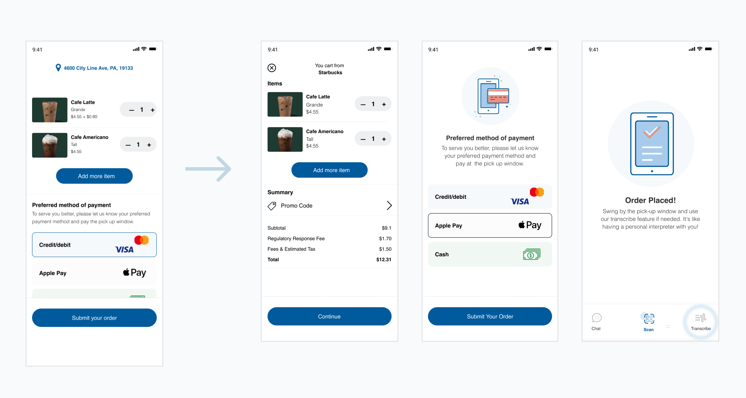
Clarifying the user's preferred payment method during the ordering process.
After receiving feedback from users, it was apparent that a clear differentiation between the view cart, payment method selection, and order confirmation screens was necessary. Therefore, I divided the flow into three distinct screens, enabling users to comprehend and complete actions more efficiently.
Allowing Order Cancellation: A must-have feature for user convenience
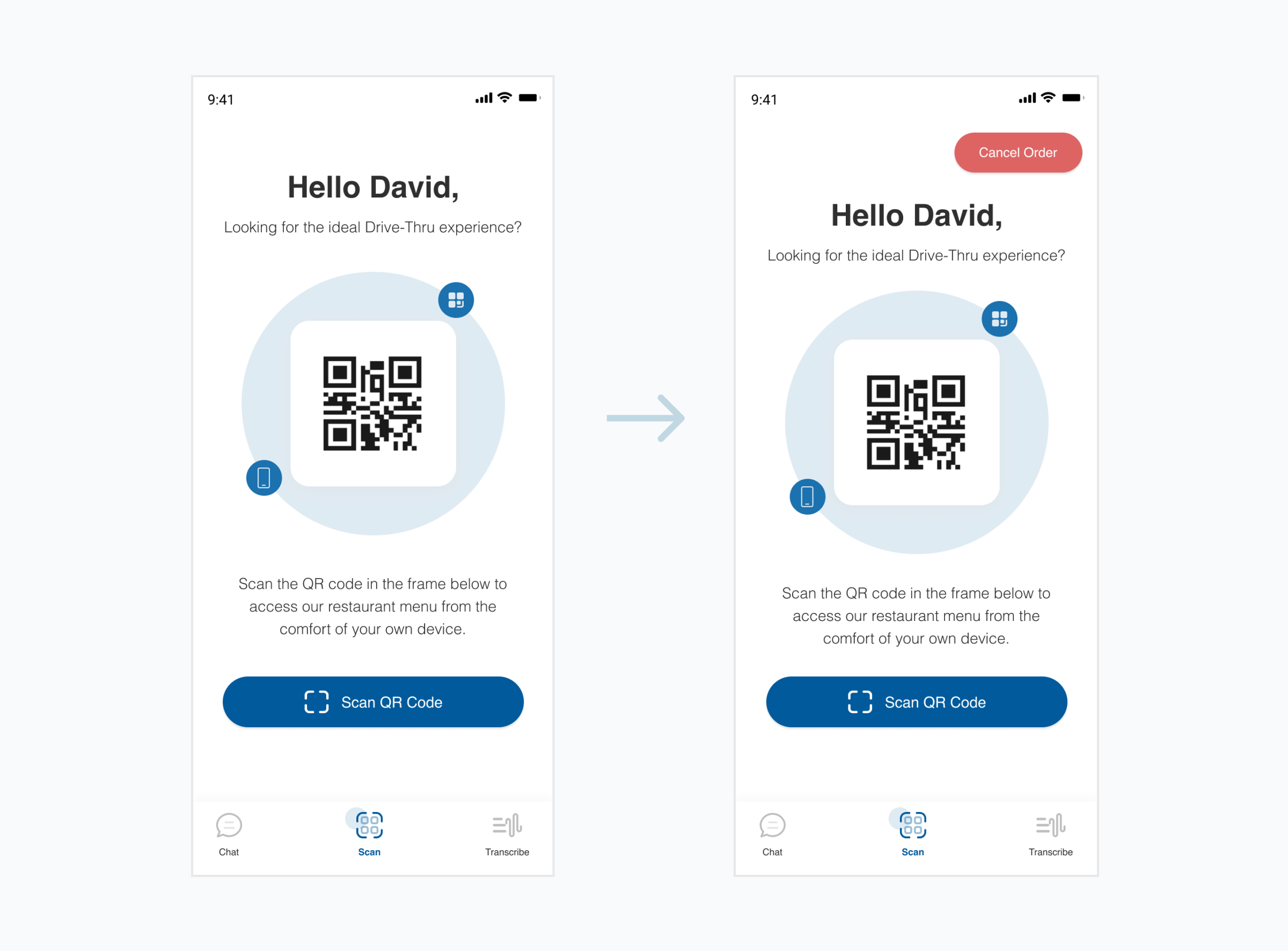
If users need to cancel their order after placing it, there should be a clear and accessible way to do so. It’s important to ensure that the cancellation process is simple and easy to understand, to avoid frustration and ensure a positive user experience. so, I designed a Seamless Order cancellation experience by introducing a ‘Cancel Order’ button on the homescreen that will allow users to cancel their order if they change their mind or have any issues with their order.
Designing Clear and User-friendly prompt to connect with restaurants
To ensure a positive user experience and encourage engagement with the restaurant, the prompt to connect with the restaurant should be clear and straightforward. To achieve this, I provided users with clear feedback upon successful connection, such as a confirmation message as a visual indicator that will boost their confidence in using the app and motivate them to continue using it.
Validating the concept of 'Quicklane'
Determining the viability and desirability of a product is crucial before launching it into the market. While there is a need for Quicklane among the deaf and hard-of-hearing community, it’s important to assess whether customers actually want such a service. To test this, the Fake Front Door experiment can be used to evaluate the product’s desirability. Additionally, it’s essential to ensure that the app doesn’t slow down the ordering process for customers. A/B testing and Mechanical Turk can be used to conduct controlled experiments comparing the time it takes customers to finish their orders with and without the app. This will help determine whether the app has a significant impact on the ordering process’s speed.
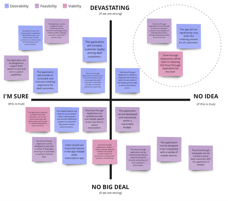
Experiment 01 - Fake Front Door
Alberto Savoia’s fake front door pretotyping method offers rapid testing and validation of concepts by replicating user interactions.
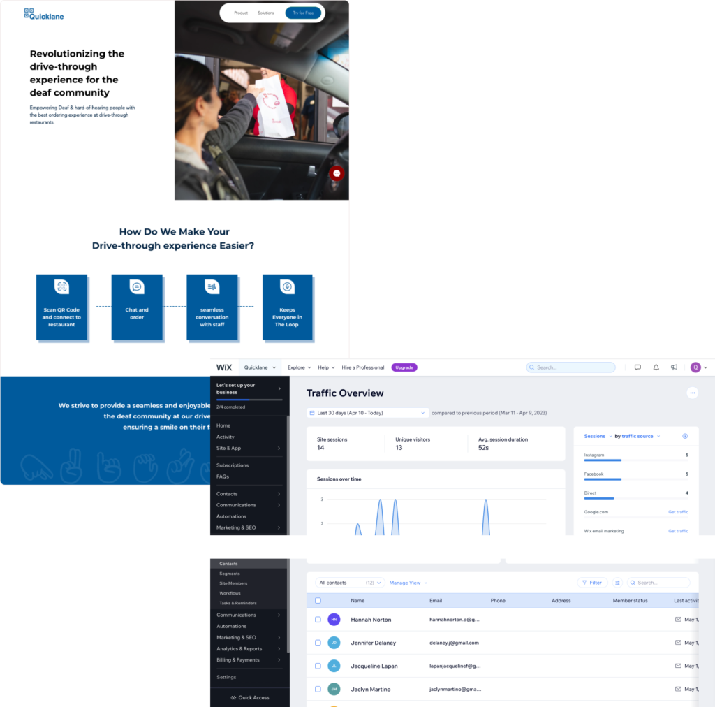
It allows for validating assumptions and assessing product viability without investing in the complete solution. In line with this, I implemented a strategy by creating a product website, along with a landing page on Facebook and Instagram. The social media ad creatives were carefully crafted to drive traffic to Quicklane’s landing page across different platforms. Sponsored advertisements were strategically posted on Facebook to guide potential customers to the landing page.The landing page served as an introduction to the product and services, encouraging visitors to share their email addresses if interested.
Risky Assumption -
Deaf individuals want a Drive-Thru Application for
ordering food at drive-thrus.
Success criteria -
At least 2 of website visitors
will provide their details for early signup.
Results -
14 – Unique visitors
04 – email sign-ups
PASS
Result
Experiment 02 - AB testing + Mechanical Turk
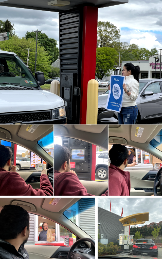
To assess the impact of the app on the ordering process speed, I conducted controlled tests by setting up a simulated ordering process with a timer. I measured and compared the time taken by customers to place their orders, both with and without the app. Through this test, I aimed to determine whether the app had a significant impact on the ordering process’s speed. Using the data collected during the test, I calculated the average time it took for an order to be placed with and without the app. By comparing these averages, I was able to determine whether the app was slowing down or speeding up the ordering process.
Location: Philadelphia
Drive-thrus explored – Macdonalds, BurgerKing, dunkin’ donuts, Starbucks
Risky Assumption -
The app will not cause a significant delay in the ordering process for any customers.
Success criteria -
At least 2/5 of pilot participants will finish their orders using the app in the same amount of time as they do now.
Results -
5/5 – Finished ordering earlier than usual
PASS
Result
Experiment 03 - Extension of Fake Front Door
Alberto Savoia’s pretotyping method emphasizes measuring success based on the time invested in testing and validation. In line with this approach, to validate the assumption that restaurants would be willing to adopt Quicklane’s drive-thru application for the deaf, I conducted a fake front extension. I proactively reached out to fast food owners and franchise owners, offering to schedule demos of Quicklane’s app. This allowed me to gauge their interest and willingness to invest time in exploring the application’s capabilities. This time-based measurement allowed me to assess the success and viability of our assumption within a specific timeframe.
Risky Assumption -
Drive-thru restaurants will be willing to adopt the
Drive-thru application for the Deaf.
Success criteria -
At least 2 out of 10 restaurants approached would dedicate 30 minutes of their schedule for a demo of quicklane app.
Results -
0 – None of the restaurants approached agreed to dedicate 30 minutes of their schedule for a demo of QuickLane app.
FAIL
Result

Business Canvas Model
Using the Business Model Canvas helped me understand the important parts of my business plan, such as value proposition, consumer groups, critical partners, and income streams. It gave a clear and comprehensive depiction, which helped with analysis, improvement, and the generation of new growth ideas. In addition, the canvas helped in a successful presentation of my business plan to stakeholders. Similarly, by clearly showing the user experience of the product application, I was able to uncover user obstacles, improve design intuitiveness, and facilitate seamless communication with stakeholders and developers.

Key Takeaways
Having dived into Nir Eyal’s “Hooked” and applied its framework to design a habit-forming product that integrates charity into everyday life, I can vouch for its game-changing impact. The book delves into the psychology of user behavior and hands out practical techniques for creating captivating experiences. By following the trigger, action, variable reward, and investment principles, I crafted a concept that has the potential to deeply engage users and instill lasting habits. It’s been an exciting journey fueled by the wisdom of “Hooked.
Phew! Wasn't that a lot?
Thank you for visiting and looking through my project. If you want to learn more in detail, please get in touch with me.
